I did a few ‘thumbnails’ to see which of my designs would best lend themselves to these proportions.
 |
| 051201 |
I chose the middle option in the second row. A square layout. I felt it gave an interesting balance of shapes and areas to explore contrasting texture and also incorporate an element of height.
I then made a template and cut up all of my various textural papers so that I could swap and reposition patterns until I found a pleasing arrangement. This was a difficult task. I’d become quite attached to and precious about my lovely papers!!!
 |
| 051202 |
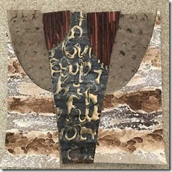
This is the layout that I most liked. It gave a nice balance of texture and tone, whilst demonstrating extreme contrasts of texture. I like the ‘holey’ tissue paper shapes and feel that these could make a perfect raised area, particularly if I could somehow mount on white so that the holes would reflect shadows, as it had in my original paper sample.
 |
| 051203 |
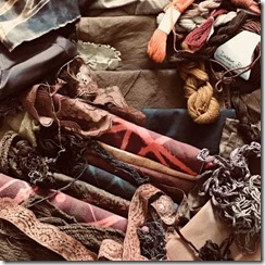
I spent an enjoyable sunny weekend dyeing, bleaching and overdyeing fabrics to attempt to achieve the required colour palette to match my selected colour scheme. Some of the fabrics needed mono-printing with brown random patterns afterwards to knock back the red colour, as, although this is just a stitch trial sampler, its important that the finished piece appears unified and considered.
 |
| 051204 |
 |
| 051205 |
I was left with a pleasing collection of varied shades of ‘brown’ which, along with existing threads and fabrics, gave me a lot to play with.
 |
| 051206 |
I thought the text in the panel in the centre of the design would be ideal worked in a tatty length of scrim couched down with rusty coloured and metallic gold threads, and copper wire. The sample was pleasing, but I felt it needed to be layered on top of a heavily embroidered panel of couched threads for the background, in order to give greater texture.
 |
| 051207 |
I couched and wrapped knotted strips of synthetic fabric, multiple strands of threads, lengths of beaded threads, knitting wools and string in mono-tone shades of brown. On top of this, creating another heavier textured layer, I couched my lengths of scrim as above, wrapping, as before, with metallic gold threads, and copper wire, some of which I twisted and coiled to give greater impact.
 |
| 051208 |
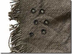
I tried working tiny buttonhole circles into a fairly loosely woven fabric, pulling it tight in order to part the threads to create holes. I loved this effect, but the paper sample had been produced on tissue paper, so I felt this was far too heavy to recreate a similar effect. As I also thought it a good idea to raise this panel to give reflection through the holes, it would require a much lighter, more transparent fabric.
 |
| 051209 |
The scrim was fun to stitch, and the pulled threads gave much bigger holes. So that it would remain rigid when raised, I stiffened this sample with ‘Paverpol’. On the whole this gave a pretty good result, but it remained a bit ‘plasticky’ and white where it dried in contact with the ceramic plate that it was put on to dry.
 |
| 051210 |
The final sample was worked on nylon organza. The holes were burned through once the buttonhole circles had been worked.
 |
| 051211 |
I experimented with stiffening with Paverpol, but this left an unsightly white opaque finish. I sprayed another sample repeatedly with starch, ironing between spraying. This did not affect the appearance of the fabric at all, but despite many repeated coatings, the result was not exactly as rigid as I had hoped for. I then glued the stitched circles to a thin sheet of clear plastic (so that glue was not seen on the fabric), and burned holes through both layers. This would hold the raised fabric panels perfectly above a white background to give beautiful reflection!
 |
| 051212 |
For the two ridged panels at the top, I experimented with different ways of creating raised bands of parallel texture. I tried tucks gathered onto sticks, which gave a pleasing effect, but I couldn’t decide how I would finish the edges of the shapes.
 |
| 051213 |
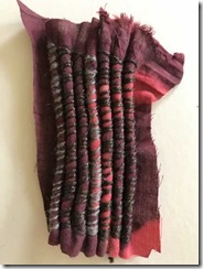
Tucks stuffed with lengths of knitting wool gave a very tidy finish, I could then snip the knitting wool slightly shorter so that I could turn the edges under neatly.
 |
| 051214 |
Parallel lengths of string, wrapped in fabric and over-sewing was fun to stitch, but the stuffed tucks above were much smoother, which I felt would contrast suitably with the heavily couched centre panel.
For the final panels, I referred back to Chapter 4’s fabric investigations, specifically ‘decorating bands with exciting edges’. When Sian reviewed this work, she suggested that I repeated some of these edges in the form of layers. This idea excited me, and I wanted to try it out for my resolved sample, as I felt it would echo the rough, linear pattern of my paper sample.
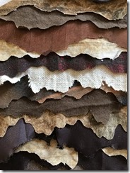
I cut lengths of various fabrics, and shades of brown, cutting the edges with an irregular, bark-like pattern. On the synthetic fabrics, the edge was burned in a similar way. I then stitched the strips to a background fabric. I was delighted with the results.
 |
| 051215 |
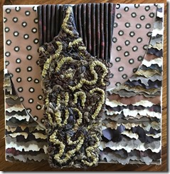
I was not sure what background/mount I intended to use, but I selected a 30cm x 30cm box canvas to start off with, as I needed the white background for the holey, organza reflective pieces. Referring back to my design layout idea, I made paper patterns and cut out each section, placing them onto the canvas in their correct positions.
 |
| 051216 |
 |
| 051217 |
It was at this point that I realised I’d made a huge mistake. I wasn’t happy at all!
I could see instantly that the middle raised panel would need stitching all abound the edge to disguise the grey fabric base that I had couched onto. This wasn’t a problem, and wouldn’t take long to put right.
I wasn’t at all happy with the edges of my ‘layered strips with decorate edges’. I felt they looked ‘shoddy’. They needed to be either rougher/frayed, or much neater & more sharp. There were also white gaps between the panels where my cutting was obviously not accurate enough. This would be accentuated when I raised my ‘holey organza, reflective’ pieces. HELP! Fortunately, Summer School was next week. I would be able to discuss the work with Sian during my tutorial.
When Sian saw my work, she felt that the ‘decorated edge strips’ were ‘fighting’ with the central panel. She felt that the whole central panel (including the stuffed tucks at the top), was very strong, and that the side pieces should be ‘knocked back’ to simply play a supporting roll to the central panel. Sian also felt that the white strips of decorate edges were too strong. I’d put these in as, firstly, the original paper design had white/light areas within it, and secondly, because I felt I needed to echo the white section that was going to reflect the holes from the organza. I had to agree though, that there was far too much going on. I could see that something was going wrong, but was too concerned about creating four fabrics with extreme contrasting textures, as per the brief, and was not paying enough attention to the coherence of the work when all pieces were joined to make a whole.
Although Sian liked the idea of the reflective raised panels of holey organza, there was too much going on to make the whole piece coherent. I could appreciate all of this as soon as she pointed it out, and after a long discussion we were in unanimous agreement that there were a few options open to me:
I could make a new panel of ‘decorated edges’, to cover the entire box frame, including the edges, then cover this completely with a new panel of organza holes, some stitched in gold to both echo the gold couching in the central piece, and also to distinguish between the four separate edge panels of my original design. This would make the central panel stand out more strongly.
Alternatively or even additionally, I could put a gold fabric underneath the holey organza to shine through the holes, or perhaps I could loose the ‘decorated edges’ panel completely, and paint the box frame behind the holey organza panel.
When I got home, I mulled the options over in my mind. Then I cut out alternative bits of fabric to try different shade options. Somehow, I wasn’t happy with any of the solutions we’d come up with at Summer School. I really liked my decorative edges and felt that, along with the other panels, particularly the holey organza, I had four extreme contrasts of texture, as per the brief.
So it was back to the drawing board. I knew that, although I was no longer happy with the solutions we’d come up with at Summer School, Sian was correct with her observations and assessment, so was there another way to put this right???!!!!
I put a photograph of my work onto the big screen of my computer at work, and turned it upside down so that Ii could evaluate it ‘out of context’. Whilst Sian was correct about the white strips being too strong, I felt that the dark strips were also causing the ‘background’ to fight with the ‘foreground’. These would both have been eliminated if the organza had been placed over the top, as the organza would have the effect of ‘knocking back’ the stronger colours, and blending/smoothing the shades within the decorative edge panel.
 |
| 051218 |
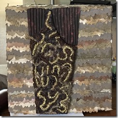
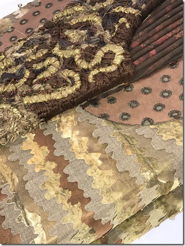
I therefore made a new panel of ‘decorative edges’ in much more subtle, muted tones of brown. The strips were more equal in tone to each-other, and blended better. With less contrast within the strips, it gave a much more gentle, smooth, unified, and perhaps a more ‘diluted’ resulting panel.
I ‘oversized’ this panel, so that I could wrap it around the box frame, making all edges tidy, whilst not losing the effect of the loose ‘decorated edges’, as I love the loose, tactile, un-attached quality of this panel.
 |
| 051219 |
This gave a much more professional, ‘finished’ appearance.
I happy with the entire central panel, so, after tidying up and stitching around the edges of the embroidered panel, I put them in place, just ‘off-centre’.
 |
| 051220 |
The visual contrast was much more apparent, and presented the central panel to much better effect. I think it served to achieve the result that Sian and I had in mind at Summer School, whilst satisfying my desire to retain all of the textural components.
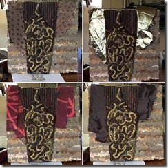
So, the final challenge was my buttonhole stitched circles on organza!
 |
| 051221 |
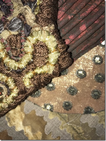
I place my original stitched pieces in situ, along with other shades of fabric, to decide whether I wanted to work the buttonhole circles on a different fabric. Although I liked the gold, I felt this detracted too much from the central panels. I still felt the first option looked the best. I decided to combine both options, and stitched the gold fabric underneath the organza, so that the ‘holes’ showed through in gold! Genius! This gave a lovely metallic reflection in certain lights, and created a fourth, extremely smooth, metallic looking, visual texture to compliment the others.
 |
| 051222 |
 |
| 051223 |
 |
| 051224 |
 |
| 051225 |
I experimented with photographs on a mirror which gave a very interesting reflection.
 |
| 051226 |
 |
| 051227 |

No comments:
Post a Comment