On the 3rdSeptember, four mrmbers of SCCS went to the 2 day Jan Beaney workshop at Bobby Britnell's.

We stayed at a lovley B&B (http://www.lloyneymillbandb.co.uk/), and had 2 great days of stitching.


 2021
2021 2022
2022
 View of the kitchen garden from my attic bedroom window.
 As an 'ice-breaker' on the first night we swapped ATC's.


 Graduation of tone using cross stitch and only black and white threads of varying thicknesses.
 A simple design showing how lines and detail can be added to make the pattern appear darker.
 Pattern development to create darker/lighter tone. Worked from pattern created on graph paper in previous exercise.
 Spacing between stitches used to control the tone. The first few rows are overlapped.
 Different thicknesses of threads used to create darker/lighter tone.
 This is an example of blackwork that I created in a previous course, showing a combination of methods to control tone.
 Sutton Coldfield Creative Stitchers were very fortunate on Saturday to have a visit from Amanda Clayton. Her workshop was called CELEBRATION OF CLOTH IN A NEUTRAL PALETTE. We were not sure what to expect, as the list of materials needed was a little bizarre and included rice, pebbles, herbs and glass!
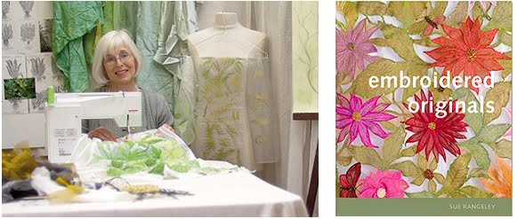 Oh, dear! Bought another book on Saturday! I went to Wolverhampton EG with a couple of friends, to a lecture by Sue Rangeley. What an amazing lady! Her machine embroidered lace panels inspired by her sketches of frosty plants were exquisite, and her silk organza skirts, jackets and bodices, appliqued with flowers made me eager to get home and try out some of her techniques! Alas, I have my priorities, so that will have to wait for another day (perhaps a workshop next year......?)
 from the top:
 ink from stamp pad applied with simple 'circles' stamp
 felt tipped pen
 ink / marker pen / charcoal / pencil on white paper
 A collection of visual information, and a list of words describing the subjects. (Thank heavens for National Geographic magazine!) These are all pasted to A3 cards and attached to the pinboard in my studio.
 'Drawing' marks that relate to my list of words (also on A3 card).
 My Albert Irvin bookwrap! Based on an Angie Highes workshop of woven fabrics covered with a layer of organza. I'm disappointed as I think I totally ruined the effect with the black stitching, but I needed to anchor the organza to the fabric strips somehow.

This was OK, it simplified the thought process because it was just black and white, it enabled me to think about the layout and not about colour. However, this became difficult when I wanted to try out the designs in multi-layers, so I did the rest in colour.


Composite Sheet


EVALUATION OF COMPLETED WORK
I am very happy with my finished design.
I think the foiled crosses merge nicely with the gold printing, as if gold leaf has flaked off the surface of the crosses and blown across the design, unifying the foreground, which gives the impression of an ecclesiastic grid-worked partition with a warm, bright, gold iconic light shining from behind.
Although I planned the design very carefully from the outset, it evolved slightly as I progressed, so, for this reason, there are not really any changes I would wish to make.
I feel it is fit for the purpose. It is a simple design showing growth and disintegration. I have used many of the methods of embroidery and decoration explored in the exercises leading up to this chapter - ripple effect and chenille applique, bondaweb and gold foil, and trapunto. I have also included hand printed fabric using my rubber stamp design and completed the project with machine and hand embroidery.
HOWEVER, viewing the design objectively, I feel perhaps that this is too much of a pattern, and should have been more of a composition. Is it too regimented and geometric? I should probably have tried to achieve something more fluid and spontaneous. Some of my samples in earlier exercises were more random, but I still struggle to feel confident about whether an irregular, unconstrained design is aesthetically pleasing. Maybe I wouldn't feel this way if I had pursued the 'crossroads' and the gnarly crossed twigs designs from my original source images in chapter 1, as I think Sian was trying to encourage.
I am slowly working through 'Drawing on the Right Side of the Brain' and admiring work of other students, such as Catherine Slater, Maren Fischer, Leanne Boughner and Jenny Marty, and also becomming aware of the work of artists such as Kandinsky with his 'shapes and swirls that fly across the canvas'. Hopefully, as I work throughout this course, my work will develop more natural fluidity.


