Monday 30 March 2009

Return to Exercise 1


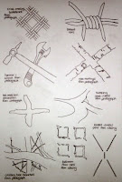
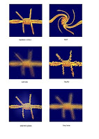
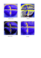
0022 sketches ........................0023 photoshop barbed wire .........0024 photoshop buns

I went back to Exercise 1 as suggested by Sian, to concentrate on more unusual sketches for my crosses. I think my original sketches were a little too 'contrived' and should have been inspired by, or derived from my gathered photographs and images. I particularly like the road marking cross and would not have noticed the worn out patches had I not studied the image whilst sketching it.
The photoshop images were great fun to play with, (with grateful thanks to Catherine for the inspiration). The results were surprising and unpredictable.

Saturday 28 March 2009

PABLO PICASSO

I saw a fascinating program on Sky Arts - Tim Marlow on Picasso. His cubist paintings were fractured images, jumbled and re-assembled - just as we have done with crosses in Chapter 3!

Still Life with Glass & Lemon

Fruit Dish, Bottle & Violin

In contrast to the fractured 'Still Life with Glass & Lemon', 'Fruit Dish, Bottle & Violin' is a collage from abstract forms - torn fragments of paper etc, built back up into visual reality.
Picasso produced many variations on masterpieces where he took work from artist such as Delacroix, Manet and Velazquez, and composed, decomposed and recomposed his own variations using jumbled-up, fractured and interlocking elements (as we have done with the last exercise in chapter 3, 'creating patterns with the new unit'.)

Las Meninas

In this variation of Velazquez's Las Meninas, he painted in monochrome to concentrate on form and space - as I think we're about to do in Chapter 4!


Saturday 21 March 2009

Chapter 3 Design Development Based on Cross Shape

0018
A delightful square shape emerged in the cenre of the positive and negative crosses. I wanted to experiment with these further on the computer.

I tried using tights in an embroidery frame for the asymmetrical distortion, with little success. I tried stretching the designs on the computer, but that seemed to distort the whole shape as opposed to just half, in order to acheive the asymmetry. I researched the fibonacci series, I think I basically understand how the mathematical pattern (1,1,2,3,5,8,13 etc) relates to the distortion and 'stretch', but this was all spoiling my fun, and after hours of experimentation I decided that sketching and guesswork gave a much better result! I found a book on Amazon called 'The Secret Code - The Mysterious Formula that Rules Art, Nature and Science' by Priya Hemenway - fortunately it was out of stock! lol!


0019
It was quite difficult to select a cross that would work with the design idea I was working on.
I think I spent far too long over this exercise, however I learned a lot from it.
I tried to keep an open mind, following instructions, not knowing where the path would take me, and in doing so, some very interesting paterns and shapes emerged. I was often tempted to 'see an idea and run with it', but in doing so I would have missed out on the exploration of different possibilities.


0020
I saw an interesting circular pattern developing within the 'repeat pattern using change of scale' when looked back at the previous page, and felt this would be suitable for the next set of exercises.


0021
Further experimentation and adaptation of shapes and patterns on computer - noting the interesting 'negative' detail that emerges when putting shapes together.


0022
The amount of patterns I was able to create with the new unit were surprisingly endless. I particularly liked the overlapping clusters that resembled flower shapes.There was an interesting negative 'zig- zag and criss-cross' pattern developing in the edge to edge pattern, and the symmetrical shape had a new cross shape emerging, made from rectangles.

Saturday 7 March 2009

Chapter 2 Making Coloured Papers

Colours chosen: INDIGO & GOLD
Inking papers was fun. It was enjoyable to experiment with shades 'bleeding' into each other. I might have sponged too much ink onto the paper as it tended to 'puddle' in places. I allowed these puddles to run by hanging the papers up to dry. This gave an interesting effect, however, if I did it again, I think I would try using a little less ink and produce fewer sheets at a time enabling me to dry them flat.
0008 Gold inked papers
0009 Indigo inked papers

0010 Inked tissue paper

0011 Inked newspaper

I tried to keep the 'splodges' as distictly seperate colours, and not let them blend to much into each other so that they become 'muddy'. I was therefore initially disappointed with some papers that I feel blended too much. When dry, however, I was pleased that not all of the papers were the same - some were blended, and some were 'splodged'. I was particularly pleased with the papers inked with both indigo and gold.

0012 indigo & gold inked papers

0013 indigo & gold magazine pages
0014 Test sheet, rubber stamp ideas & ink recipes

0015 Rubber Stamp

I was surprised by how easy it was to carve the eraser.
I was pleased with the indigo stamped onto the gold paper, in particular, I liked the pattern where the stamped images formed squares.
The gold acrylic paint onto the indigo paper looked a bit translucent and gave a much more subtle contrast than the indigo onto gold.

0016 Stamped papers

Cross Shapes from Coloured Papers

When cutting out some of my cross shapes I realised that some are far too elaborate to develop through to the next chapter, and also far too complex to experiment with different cutting implements. I therefore introduced a few more simplified shapes.

I love the cotrast between the indigo and gold colours. Using opposing colours from the colour wheel appears to bring the shapes 'alive', and helps them to be seen as interesting design elements.

Sunday 1 March 2009

Module 1 Chapter 1

0001 Definitions of crosses & stars

I have been avoiding uploading images as I feel that I should also be adding notes at every stage, however, for Chapter 1, I think that the definitions page is probably sufficient?


0002 Internet Images

After spending 2 whole evenings scouring copies of various magazines looking for images of crosses, cross shapes & patterns, I gave up and did my research on Google images. This was much more successful! I found some very attractive images, particulary in stained glass.


0003 Photographs of cross images

The more I looked, the more I found, at home, at work and in the supermarket. My husband was particularly pleased with the hot cross buns. 77p per pack, 80p for two, and I don't like them!


0004 Rubbings

The results were surprising. Objects like the basketweave pattern on the backof the chair was not so good. Neither was the hessian. The bathroom floor tiles and the bathroom scales that were rubbed in different directions were very pleasing.


0005 Line Drawings

These sketches were fun. I was able to let my imagination run wild. I was particularly please with the 4 legged octupus style image. When I ran out of inspiration, I found some very atractive medieval cross images in clipart.


0006 Colour Wheel

I learned a lot from producing the colour wheel. I was aware of 'opposite colours' for the primary and secondary colours, but the tertiary colours were exciting, especially when producing the shades and tints.


0007 Rejected star images

I chose to study crosses as the assortment of images I found were more varied and diverse than the star shapes.