
I decided to try my next cross pattern completely in organza. The first layer in gold, the second in indigo and the top layer in light gold printed with yellow and orange. As I fused these together, the sun shone on the ironing board and the irridescent organza sparkled like magic. The photograph does not do it justice. For the third cross, I decided just to use shades of indigo and to experiment with texture. I put hessian on the bottom layer, linen noil in the middle, and a prined shiny polyester on top. I also rotated the arrangement slightly which added a bit more interest. I call this my 'Flintstones' pattern!
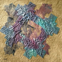
For the forth pattern I chose all 'gold' fabrics, again using a variety of textures, prints and plains. This time I thought I'd be really adventurous and try 4 layers, and also completely 'off-set' all of the shapes.
This design has thrown me into turmoil! I don't like it very much, there is absolutely no symmetry or connection in the layers. I think I've pushed the boundaries too far, however, when I look back now at the first 2 designs that I was initially very please with, they appear quite dull and uninteresting.
At the risk of sounding pretentious, I feel I've learned something very important during this exercise.
I've always felt inclined to 'hold back' on my 'best' ideas to use at the final stage. Now I'm learning to put that idea to the test immediately it springs to mind. If it really is that good I can always use it again, or even improve upon it, but more importantly, the more ideas I experiment with, the more interesting and adventurous ones I seem to come up with, so that 'precious' idea evolves into something much more exciting.
30th May 2009
Thr3fold Book Launch - Bramble Patch
What an inspiring day!
Laura Kemshall demonstrated wonderful control over free motion machine stitching. I was particularly inspired by one of her quilts. She had quilted a cloth of a roughly and randomly pieced variety of fabrics, which she then painted all over with white emulsion paint. The result was then used as an 'artists canvas' on which she painted an image of a pair.

Linda Kemshall stressed the importance of drawing and sketching on a regular basis, and Catherine Nicholls demonstrated printing blocks she had created with 'funky foam'. Rather like a large version of the eraser stamps we created in Chapter 2.
The girls regularly create challenges for each other which pushes their boundaries and encourages them to experiment with concepts that they would not normally entertain.
6th June 2009
Trinity Fair
I have spent every spare minute over the last couple of weeks printing flyers and making bookmarkers, cards and bookwraps to sell at our local church fair. The main purpose was to promote interest in our new embroidery group, Sutton Coldfield Creative Stitchers. It was good fun and a big success, but now I can get on with painting my bondaweb!
12th June 2009
Painting Bondaweb and Using Tissue Paper
 As with all exercises that I look froward to, I got off to a difficult start. I loved the crumpled tissue paper. The ripples and creases gave a lovely textural effect. I found if very difficult, however, to predict the results of the painted bondaweb, so it was hard to choose suitable background colours and fabrics. When fused to fabric, the results of the first 2 samples were dissappointing.
 Perseverence paid off however, and I started to enjoy the exercise when I put the indigo painted bondaweb onto the 'gold' background.
The contrasting colours accentuated the rough imperfections of the bonding fibres and their web like texture.
Removing the rectangular background seemed to remove unneccessary 'clutter' and helped the bondaweb develop its own identity.
 I sponged the next piece of bondaweb, half with prussian blue and violet, and half with lumiere halo violet-gold, and tore the shape of the cross.
I was so excited with the result that I photographed this stage bofore applying the next shape in case I spoiled it!
 I was very pleased, however, with the slightly off-set tissue paper. Using just 2 shapes seems to keep the design simple, yet the off-set patterns make it interesting.
 The next pattern created by 2 layers of torn and painted bondaweb is my absolute favourite so far. The first layer was sponged with Lumiere halo violet-gold, with a little prussian blue blended delicately here and there.
 The second layer was sponged with a random mix of prussian blue and violet. The crosses were overlaid symmetrically, although it is hard to tell as the torn edges are so irregular.
I love the subtle pearlescent shimmer and the random, unpredictable irregularity of this design.
 I liked the last design so much that I had to do another. This time I used gold textile foil for the cross on the first layer. The second layer of bondaweb was sponged with prussian blue and violet. I liked the metallic luxury of this design contrasting with the coarse, tactile texture of the 'gold' linen background.
13th June 2009Making a Decorative Bonded Fabric
 (Using a new cross pattern, and larger 20cm square samples
).
I started off with a base layerof mid blue cotton fabric and sprinkled this with random pieces of frayed scrim. I added snippets of orange and yellow cotton fabric and then tore thin ribbons of metallic gold (as used for the background rectangle). I finished it off with spirals of yellow weft threads pulled from frayed linen.
I experimented with various colours of organza for the top layer of my new fabric, but decided that violet showed off the colours beneath to their best advantage.
It was really difficult to put scissors to this beautiful new fabric, but I cut the cross shape and placed it onto a cross of plain indigo hessian. This was then fused to a rectangle of metallic gold fabric.
I am very happy with the combination of textures in the end result.
 For the next sample, I used a selection of blue and purple celophane sweetie wrappers overlaid with strands of gold tinsel and sprinkled with gold sequins and glitter.
I chose a plain gold coloured slub weave fabric for the cross behind this, and for the background rectangle I chose a shiny violet synthetic fabric stamped with dark blue patterns.
 Snippets and off-cuts of orangeand yellow thread were topped with gold glitter and a thick yellow slub yarn and then 'sandwiched' with a graduated blue/yellow organza.
Somehow, the darker coloured organza used on the previous 2 samples seems to offer less reflection and therefore shows off the threadsand fabrics beneath to better effect, however it is fascinating to see how different coloured organzas can make such a difference to the colours of the threads underneath.
I experimented with various crosses underneath, but decided that the blue crumpled tissue paper complemented the pattern best, although in hindsight, I think that torn edges would have looked better on the tissue paper.
 I have a beautiful field of buttercups in front of my house and wanted to preserve, and create a fabric from some of these.
I thought it would be fun to experiment with a layer of angelina on top (sprinkled with snippets of yellow cellophane sweetie wrappers.)
I think the result is horrible. The angelina looks gaudy and vulgar. If I was to use this again it would need to be used with much more subtlety.
This exercise has proved the value of experimentation - good results are not always to be expected!!!

 After serving teas and avoiding boring AGM's I spent an enjoyable afternoon shopping for more books, threads and supplies, followed by a hilariously entertaining talk by Jennie Rayment. Amusement aside, I was particularly inspired by her use of calico and fabric manipulation by 'nips, tucks, twiddling and fiddling!'
 Our Guild spent an educational and enjoyable day visiting Hampton Court, the Royal School of Needlework and the Embroiderers Guild museum collection.


