So, I think I enjoyed this chapter a little too much, which is good, because I’ve always been a little bit bored by mark making. Couldn’t see the point, but now its making much more sense to me. Its fundamental to any work, and when you look at the work of Shelley Rhodes and Amanda Hislop and Gwen Hedley, there is beauty in the way they explore ways of using creative mark making.
The aim was to decorate some papers with both flat textures and raised textures, exploring ways of making marks which related well to the textures in my source images. These will then be cut up to make designs. The colour must be based around one main colour that is suggested from the landscape research images.
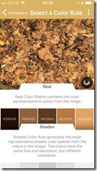
I found a lovely app for my phone, Real Colours is a palette generator. It analyses a photograph and generates the 5 most representative colours from the image.
 |
| 051101 |
This was really helpful in assisting me to select a colour range.
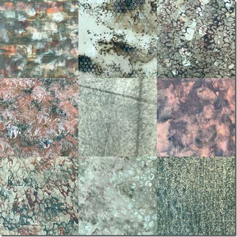
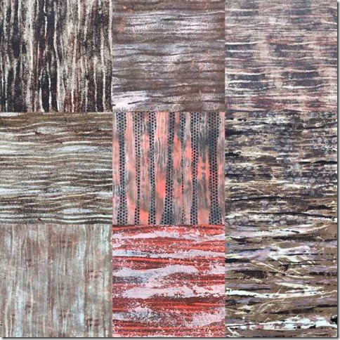
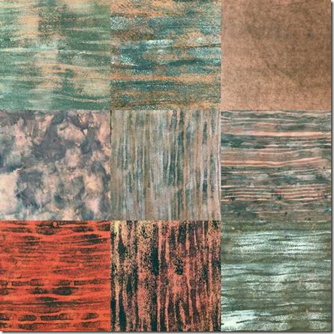
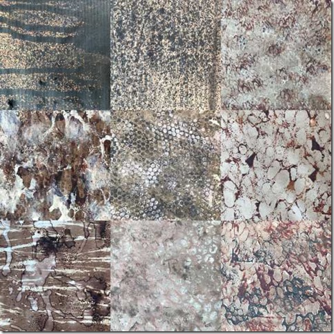
The next step was to create papers with flat textures. I experimented with a large range of different papers, newspaper & newsprint, cartridge paper, tissue, lens tissue, abaca tissue, tea bag and deli paper, mulberry paper, khadi paper, hand made paper and Chinese rice paper.
 |
| 051102 |
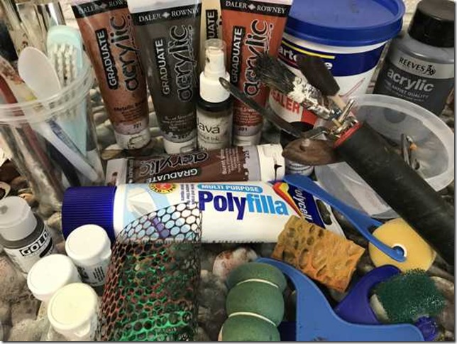
I painted these with a combination of walnut ink and bleach, acrylic paint and brusho, then overprinted with natural sponge, and various rollers & stencils to create a selection of colourful papers.
 |
| 051103 |
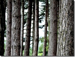
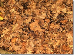
I selected a couple of images to use as pattern inspiration.
 |
| 051104 |
 |
| 051105 |
I felt that the strong rigid linear format of the trees gave a pleasing contrast to the irregular, random, scrunched pattern of the leaves.
 |
| 051106 |
 |
| 051107 |
 |
| 51108 |
 |
| 051109 |
Next I worked on raised, relief textured papers.
 |
| 051110 |
 |
| 051111 |
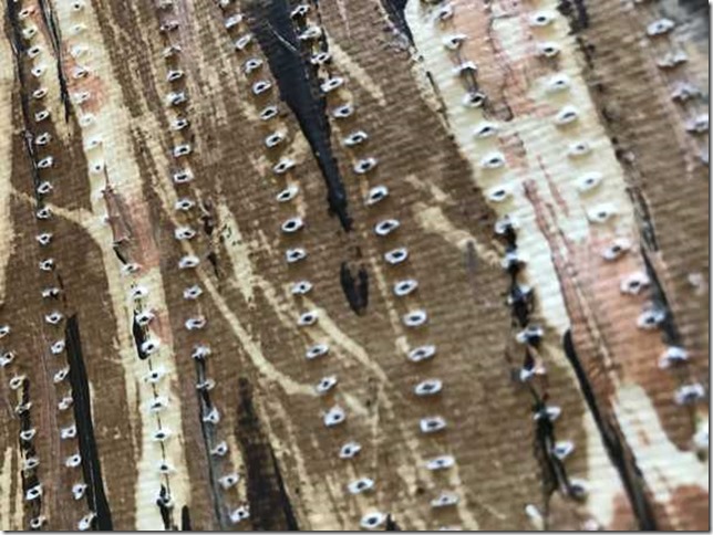
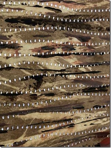
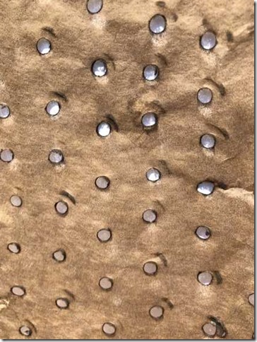
firstly I selected one of my painted khadi papers & stitched slightly wavy lines to echo the linear patterns on the paper. I used a wing needle from behind to give a ‘punched out’ slightly raised texture of holey lines. The light shines through these holes which adds another exciting dimension to the paper.
 |
| 051112 |
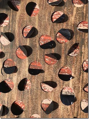
Selecting another painted paper, I painted the reverse in dark brown. I then used a leather punch in a half moon shape, hammering semi-circles into the paper and folding back to reveal the back of the paper. I placed this over a burnt sienna patterned paper.
 |
| 051113 |
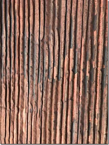
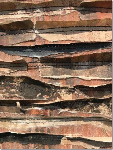
Simple, but effective with its rough, linear texture, I painted some corrugated card!
 |
| 051114 |
On a piece of painted deli paper, I used a soldering iron to burn holes. This gave a lovely light reflection when placed in sunlight on white paper, with the holes edged in the darker brown singed paper giving a slightly raised texture.
 |
| 051115 |
I tore strips of decorated papers and stitched them to another painted background with a twin needle. I then folded some of the papers back to give a raised texture.
 |
| 051116 |
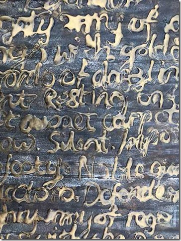
I loved the decorated text used in the last chapter, so was compelled to compose a collection of words about my source images and write it with hot glue gun over another decorated paper before using a gold metallic ‘rub-on’ (I didn’t have copper to hand!)
 |
| 051117 |
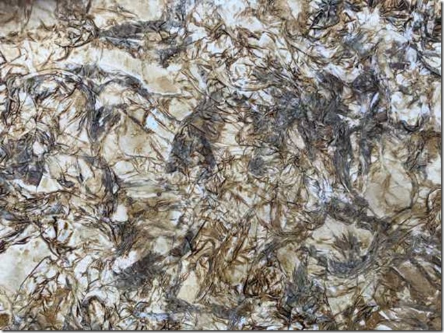
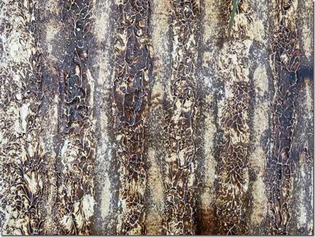
Scrunched tissue paper stuck onto a firm sheet of watercolour paper with a thick layer of PVA. Painted when dry with a wash of walnut ink. I love the way the different textures in the paper hold the ink so that it appears darker in some places than in others.
 |
| 051118 |
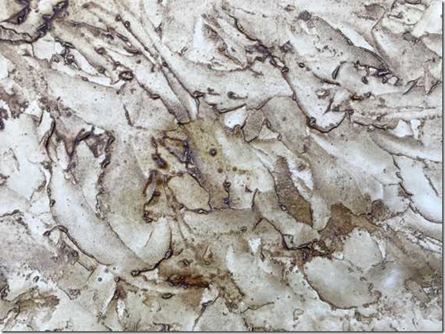
Lines of texture paste textured with a child’s sponge roller, again painted with a wash of walnut ink when dry. I love walnut ink! The colour changes within the different surface textures are amazing!
 |
| 051119 |
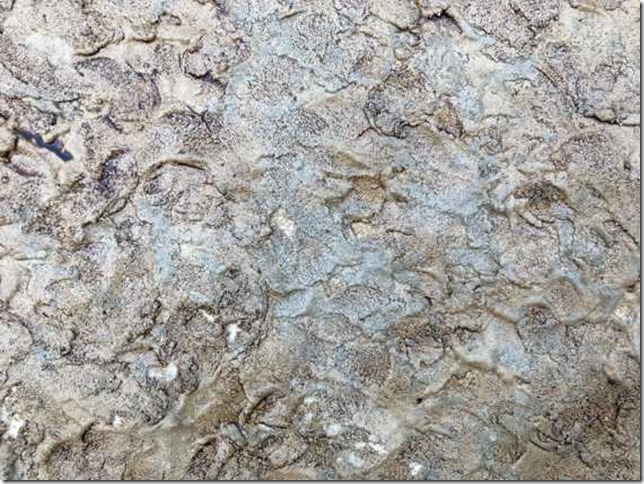
I scraped pollyfiller onto a sheet of watercolour paper with a palette knife, trying to get a combination of rough and smooth random marks which were then enhanced with walnut ink. I think I should have tried to leave patches of paper without the polyfiller, it might have given an even more interesting colour effect.
 |
| 051120 |
I mixed sand with PVA and spread it onto watercolour paper with the back of a spoon, to give a very heavy texture. I’d like to play more with this process, experimenting with different consistencies and thicknesses of ‘paste’ to create different textural patterns. The wash of walnut ink was absorbed into the texture, so perhaps a layer of gesso might have been a good idea before painting. I think there is room for a lot more exploration!
USE OF SHAPE
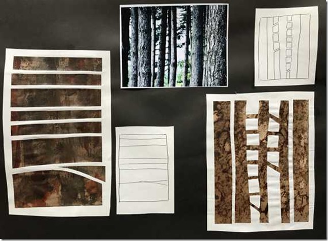
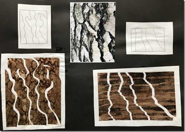
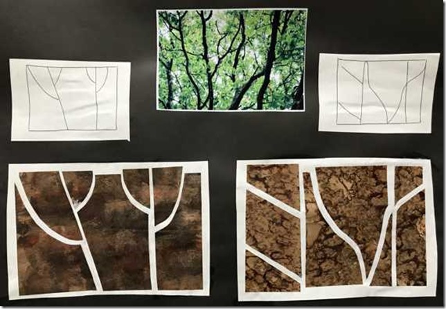
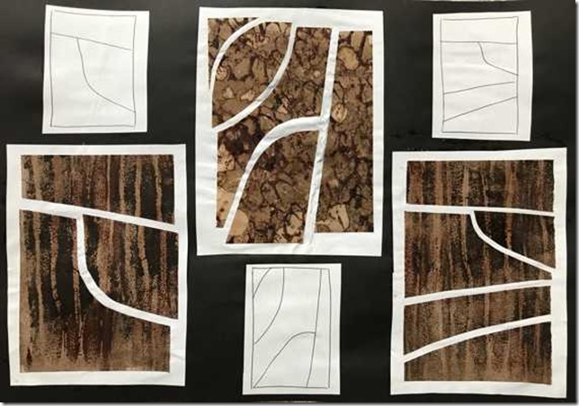
Referring to my source images, I looked for simple divisions to create shapes. I made line drawings, and then used some of my decorated papers to subdivide in different ways.
 |
| 051121 |
 |
| 051122 |
 |
| 051123 |
 |
| 051124 |


Fabulous work Julia! Such a huge variety of inventive ideas.
ReplyDeleteI'm loving these samples!
ReplyDelete