Whilst working through the chapters in this module, it has
become annoyingly apparent that I had not included email and social media in my
initial research, and yet it is such an integral part of our everyday lives.
 |
| 4.11.01 |
 |
| 4.11.02 |
I have also recently had to buy a new computer after my old
one crashed. In the process of updating operating systems, I found myself
confused by a bombardment of ‘apps’ instead of programs, lost files and various
compatibility issues!
Inspired, if not frustrated by this, I did a little image
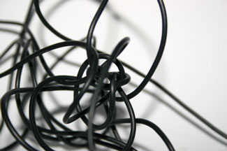
research on Google. I came up with the idea of a grid-work pattern of social
media icons as appears on iPhone etc, all joined together with a tangled
arrangement of black cord resembling the spaghetti like mess of cables and
wires that we all have hiding behind our TVs and computers, even in this new
age of Wi-Fi.
 |
| 4.11.03 |
Excited by this, my next decision was how I should present the icons, and what would be their purpose?
I soon stumbled upon the idea of folding the icons into a
box, or cube. All sides would be connected, with no opening. No visible access.
No way of getting inside. The idea being that inside this box is all my emails,
corrupt files and lost data that I can no longer gain access to!
 |
| 4.11.04 |
I made a 'prototype' box to ensure that the structure would hold its shape.
 |
| 4.11.05 |
The plan was to use a selection of different embroidered panels for each of the little squares, but Sian felt that the right side of the recycled cereal packets would made an interesting contrast.
 |
| 4.11.06 |
I took a little persuading, but once these were decorated with PVA text and embellished with gold 'rub-on' I had to agree that it created a lot more interest, and also followed the theme of recycling found items from summer school.
 |
| 4.11.07 |
The third group of 'icons' were metal rectangular frames, wrapped with thread and dipped in paper pulp.
 |
| 4.11.08 |
The final grouping gave a varied and contrasting arrangement of 'icons', Holes were punched around the edges of the squares using a leather punch (thanks to 'the Alisons' for that suggestion at Summer School) that were then joined together with thin electrical LED wire.
 |
| 4.11.09 |
 |
| 4.11.10 |
 |
| 4.11.11 |
 |
| 4.11.12 |
 |
| 4.11.13 |
Sian suggested it might be a good idea to 'mount' the box on more tangled wire. I played around with different arrangements of 'mess', but found that if I spiraled the wire like telephone wire, it had a lot more strength and stability and was able to support the box. This enabled me to display the box at an asymmetric angle.
I am exhibiting the box at our 'Stitchers' biennial exhibition and felt I needed to explain the idea and inspiration behind the box, so I mounted it on a mirror (inspired by Sian's Murmurations) edged in black card and wrote the inspiration for the piece around the edge.
 |
| 4.11.14 |
 |
| 4.11.15 |


What a fabulous idea Julia! I love your icon cube and the colours you have used which are restrained but exciting. The electrical wire stitching joining them works well.
ReplyDelete