Sunday, 15 November 2009

An interesting week!

Wednesday's edition of 'Talking Threads' showed Fay Maxwell demonstrating a 'slashing' technique, very similar to a combination of Chenille Applique and the multi coloured ripple effect. It was interesting to see how she put the technique to use. It would be lovely to have more time to experiment with some of these methods.

On Saturday a group of us went to a talk by Michael Brennand-Wood, hosted by the Midland Textile Forum. I was aware of his work and have to admit to not being very enamoured by it, but it was interesting to hear the thought process (or 'sub-text') behind some of his work, and how a collection of work developed and evolved. I'm still not a fan, but I now have much more respect for his work.

Saturday, 7 November 2009

Chapter 9 - Reverse Applique - Traditional and Contemporary Methods


TRADITIONAL METHOD

Onto a background of gold, my first layer was a violet cotton fabric, followed by a deep yellow cotton and an indigo printed layer on top.
Adding, cutting away and stitching one layer at a time, it was very time consuming but the results were extremely rewarding. I love handstitching and also recreating traditional embroideries, so a bit of research into the traditional molas of the San Blas Islands made this a very enjoyable exercise.


CONTEMPORARY METHOD USING MACHINE STITCHING

Its good to have 'quilty' friends. A visit to a quilt show at Malvern turned up some very attractive random dyed fat quarters in indigo and gold. I used one of these for my top layer of this design, followed by a violet organza, a yellow linen and then a blue cotton fabric printed with yellow for my base layer.
Using a gold metallic thread in my bobbin, I stitched each line from the back and cut away before stitching the next layer.
I was particularly pleased with the organza layer. The 'orange' effect that it gave took me totally by surprise, although with its transparent nature over the yellow linen, it should have been obvious!

The second machine stitch sample was worked from the centre out. I thought it would be an interesting execise to use the same fabrics as the previous sample to see how the process affects the end result.
I really like this method of applique. It is quick, simple and effective.

'CHENILLE' OR SLASHED REVERSE APPLIQUE

I tried to choose fabrics that would fray easily. For the top layer I chose a yellow / orange printed silk noil as I love its texture. Under this I put an indigo cotton, followed by an orange synthetic silky fabric. The background layer is gold, although this cannot really be seen.
All layers and rows were stitched at the same time with a double row of stitching. The top 3 layers of fabric were then slashed with a sharp pair of scissors between each double row of stitching, then the raw edges were worked with the side of a pair of scissors to fray and distress them and to form a 'pile'. This proceedure took longer than the stitching but I think the result was well worth the effort.


MULTI-COLOURED RIPPLE EFFECT

Crazy!

I chose the most intricate design from my black & white cross shapes. My main concern was fitting in enough rows of stitching to form the 'ripple' effect.
Although I followed the instructions step by step, I had no preconceived ideas of how the finished sample would look. I love the results. I think it looks spontaneous and exciting.
In retrospect. I would have liked to have put the glittery purple mesh fabric (seen in the central cross shape) across the entire bottom layer.

Sunday, 25 October 2009

Chapter 8 - Complex Samples

I kept the first sample simple as I was a little unsure of how this method was going to work. I bonded an indigo linen cross shape onto the violet polyester satin, and then machine stitched another cross shape over the top in a concetric pattern of variegated orange/yellow thread. I padded the central rectangle from behind. I'm not very impressed with the end result. It's very uninteresting and I think I've possibly 'over-stuffed' the centre.
Perhaps I will return to this sample when I have done a few more and hopefully have a better idea of what I am trying to achieve.

To make things more interesting on sample 2, I tried adding more layers.
On an orange shiny printed background, I bonded a yellow printed cross, over which I bonded a narrower indigo cross, machine stitching concentric gold squares in the centre for a bit of sparkle and to tye up with the gold printing on the background layer. I then repeated the outline of the first cross pattern at 90 degrees with machine stitching which gave interesting corner shapes that I filled with wadding from behind. I accentuated the outline of the finished shape with a chunky indigo running stitch which echoes the indigo printing on the yellow cross shape. I also machine and hand stitched a very interesting inner 'star' shape that had been created by the overlapping crosses.
I like the contrasts of the bold, vivid colours and the way the hand stitching helps all the shapes relate to each other.

On sample 3, I bonded a solid rectangular yellow cross shape onto an indigo printed cotton background. Over this I asymetrically bonded another cross shape in gold organza which I machine stitiched in concentric patterns. To the organza layer, I aligned a simple linen indigo cross, cut in relief , overcast by hand in ochre thread, and stuffed. The top and bottom indigo layers 'sandwich' the yellow & gold layers quite nicely, and the ochre stitching helps to tie everything together.
On sample 4 I bonded an indigo hessian cross onto printed yellow cotton. Over the top of this, I machine stitched the outline of another cross in gold zig zag stitching. The top layer is an orange hand-stitched cross, woven in the centre and stuffed. It was interesting to stuff the hand-stitched rectangle in a stump-work fashion, along with the hessian, it created a much more tactile, textural piece compared to the others, but I'm not really happy with the finished sample. Perhaps it's because none of the layers relate to each other.

I was beginning to get a bit despondent at this point. The only sample I was really happy with was no.2 and I was unable to identify why that design had worked and the others hadn't. I looked through my previous exercises again and came accross 0059 with its skewed and distorted arrow head crosses.
I cut my first cross in relief from gold printed organza, and bonded this onto metallic gold fabric. This dulled and 'knocked back' the glitz of the metallic gold. I then overlaid this with a similar shape created entirely from running stitch in idigo thread. I added a back layer of calico, machine stitched around the inner organza cross, allowing me to pad the metallic gold cross from behind. I think this gives a very interesting effect as the running stitch cross also overlaps the padded areas.

I love my last sample, but I think its just because I got carried away with the hand stitching on the top cross.
The first layer is a very simple orange cross bonded onto an indigo linen background printed with gold. The top cross is hand stitched with rows of running stitch and french knots in a blue/violet variegated thread. The corners of the cross are embelished with rectangular buttonhole stitch shapes. The central orange cross was then cut away to reveal the indigo background to which I added a calico backing and stuffed.
I like the way the variegated thread reflects the random dyes background fabric, and is accentuated by the vivid contrast of the orange middle layer.
I think this design could be improved by the use of shisha glass inside the buttonhole stitiched corners.


Although I was really glad to complete this exercise, I forced myself to return to my first sample, to see if I could improve on it. I decided to accentuate the diamond shape by couching metallic threads, cutting the ends and leaving them loose of the surface. I think this helped add a touch of opulence to the dull, muted tones of the original design.

Monday, 10 August 2009

Chapter 7 extended


It was Sian's suggestion that I recreate 0037 in stitch. I really didn't like it first time around, so it was with a heavy heart that I got started.

As I'd really enjoyed my results with painted bondaweb, I chose this method for my first layer as opposed to fabric, but before painting the bondaweb in orange, I first printed it in gold with my rubber stamp pattern. So far so good. I tore the edges to make a rectangle and ironed it onto my background fabric.

Next up was the metallic gold fabric. I overcast the edges to give a frayed effect in order to compliment my next layer - the printed yellow scrim.

I was really pleased with the effect at this stage. The stitching defined the egdes of the fabric which seemed to make so much difference to the previous, bonded design. I was tempted to leave it here, but felt I needed to completely recreate the previous design. It is merely an exercise afterall! If I spoiled it, it would be a lesson learned!

Luckily, I really like the final result. The last layer of organza is almost invisible, but serves to 'knock back' the metallic areas that it covers. The outlined edges of 'nothing' seem to compliment the design nicely.


This is a recreation of 0054.

I am really happy with this design. I love the way the printed patterns merge with the fabric on the layer beneath, ie, the gold stamping on the paler blue fabric merges with the gold bottom layer, and the indigo stamping on the top layer merges with the indigo fabric layer underneath it.

I also like the way the colours get stronger and more vivid towards the front - from muted gold, through indigo tint to a stronger blue, topped with a vivid citrus yellow.

I edged the first layer with 2 rows of running stitch on the outside of the design - cutting in 'negative'. I left loose thread ends on the gold stitching around the indigo layer.

The stitching around the top layer gives an exciting 'frayed' impression which softens or 'furrs' the edges making them appear less harsh.

All layers were positioned randomly. I am becoming more 'at ease' with the irregularity, and starting to enjoy the spontineity of asymetry, particularly when looking back at the geometric designs which look rigid and characterless in comparison.


This is a recreation of 0052.

I love the vibrancy of this design.

I had intended to use orange on the top layer right from the start, but after stitching the strong blue cross over the yellow muslin, I felt I needed a much more 'muted' tone for what was going to be my last layer.

After adding the gold cross I really hated the design. I was also disappointed with the layer of yellow frayed muslin that I'd stitched and cut in negative. I intended for this to 'anchor' the design, but I think it looks slightly insignificant.

At this stage, I decided that nothing would be lost by adding an extra layer of orange (stamped with gold). Amazingly, it seemed to balance and transform the whole design. The randomly placed skewed and distorted crosses seem to have fluidity and 'movement'. I like the shapes and colours they form in the spaces.

The overcast edges give a lovely 'tatty' effect. Our Guild was visited recently by textile artist, Stephanie Redfern. She stitches apliqued shapes to her quilts with large overcast stitches around the edges. It looks very simple but amazingly attractive and effective.


Saturday, 18 July 2009

Chapter 7 - Translating Layered Designs into Embroidery

This is my first attempt at stitching with the designs. It took me a while to understand how I should do it but I think I got it right...

I 'tacked' the lines from the design drawn on the muslin on the back layer, embroidered along these lines on the 'right side' and then cut away to reveal the first cross. Then I repeated the process with the second layer of fabric.

I'm very happy with the result and am brimming with ideas for further samples.

Upon reflection, I notice that my favourite samples seem to use a combination of metallics and texture, although, unwittingly, they seem to be using the same colour/print combinations. I will attempt to exploit this theory using different textures and metallics from my 'stash' in my next samples.


I really like all the fabrics that I have used here. I love the frayed roughness and transparency of the yellow scrim and the textural contrast of the gold metallic cross stitch. The smoothly woven blue linen cotrasts strongly in colour and texture to the coarse orange & yellow space dyed noil silk background, yet the gold stitching and yellow print help to integrate the blue linen with the other layers.

I am really happy with this design. The only metallic used in this sample is the small violet stitching used to integrate the dull gold layer with the background fabric. The random dyed cotton pearle thread, along with the randomly printed blue fabric on the top layer seem to make the design appear quite simplistic (perhaps rustic?), even though the layers are quite intricate. The dark violet background fabric makes the lacey pattern of the lighter fabrics stand out well.

Another simple, rustic design. I like the way the blue cross stitch edging to the printed fabric ties in with the frayed linen, and works to seperate the similarly coloured cross on the top layer from the background fabric.


I am glad, at this point, that I heard from Sian. I have been thoroughly enjoying stitching pretty little 'cross' samples and slipping back into my comfort zone of geometric harmony!
For this sample, I chose to push the boundaries and make my design slightly asymetric. I stitched and cut the organza on the 'other side' of my 'tacking lines'. The double row of metallic stitching helps to distinguish the edge of the organza, which, in some lights, is hard to see, although I do like the way it changes the tone of the blue printed fabric where it lies on top of it.
At Sians suggestion, I have bought 'Drawing on the Right Side of the Brain', in the hope that it will help free up my designing. I still fail to see anything particulary pleasing in this design, although I can see that it is more interesting than the geometric ones. It also took me a long time to decide exactly where and how the top layer of organza should be positioned, so I would not have stitched it into position if I wasn't happy with the arrangement.....?

To take things to complete extreme I decided to use three layers of the same cross in varying weights of fabric, but in similar shades. The only colour cotrast/accent being the indigo stitching around the square central element of the cross. In a concious effort to break rules I left the ends of the thread loose on the surface. I like this.

Saturday, 27 June 2009

Saturday 20th June
Embroiderers Guild West Midlands Regional Day

After serving teas and avoiding boring AGM's I spent an enjoyable afternoon shopping for more books, threads and supplies, followed by a hilariously entertaining talk by Jennie Rayment. Amusement aside, I was particularly inspired by her use of calico and fabric manipulation by 'nips, tucks, twiddling and fiddling!'


Thursday 25th June
Hampton Court Palace

Our Guild spent an educational and enjoyable day visiting Hampton Court, the Royal School of Needlework and the Embroiderers Guild museum collection.


We watched as students worked on huge banners for Dover Castle, and then visited a labrynth of storerooms within the Palace that house and preserve the treasured collection of embroideries protected by the Embroiderers Guild.


Followed by a visit to the bookshop.....!


Saturday 27th June
Chapter 6 Revisited


I really didn't like my last aplique design with the buttercups and angelina, but as I'd put so much thought and time into it, I decided to look at it again and decide how it could be improved upon.


In 'real life' the piece is very 'limp', so I took it off the cotton background and layered it onto a violet coloured heavy canvas. I think this gives the piece a lot more stability, with contrast in both colour and texture. I am still disappointed that I used a white nylon chiffon to cover the buttercups, but there is not a lot I can do about that now, other than to serve as a lesson learned. Experience has showed me that darker colours usually seem to display the items underneath to better effect than lighter colours - I don't know why, perhaps it is something to do with light reflection?

Sunday, 14 June 2009

Chapter 6: Use of Bonding (Transfer Adhesive) in Aplique

24th May 2009

I chose to start simply and to reproduce my cross image as closely as possible to the paper samples that I made in chapter 4. I tried to vary the fabrics by using a selection of printed and plain. I was so pleased when I put the layer of scrim on top. The subtle texture looked really exciting.
I found some 100% organic cotton cleaning cloths at the supermarket. Ithink perhaps they are felted? (They dont appear to be knitted or woven). I dyed them with my other fabrics, but they didn't seem to take the colour too well. I was disappointed with the result at the time, but it has made a perfect background fabric.


I decided to try my next cross pattern completely in organza. The first layer in gold, the second in indigo and the top layer in light gold printed with yellow and orange. As I fused these together, the sun shone on the ironing board and the irridescent organza sparkled like magic. The photograph does not do it justice.


For the third cross, I decided just to use shades of indigo and to experiment with texture. I put hessian on the bottom layer, linen noil in the middle, and a prined shiny polyester on top. I also rotated the arrangement slightly which added a bit more interest. I call this my 'Flintstones' pattern!


For the forth pattern I chose all 'gold' fabrics, again using a variety of textures, prints and plains. This time I thought I'd be really adventurous and try 4 layers, and also completely 'off-set' all of the shapes.

This design has thrown me into turmoil! I don't like it very much, there is absolutely no symmetry or connection in the layers. I think I've pushed the boundaries too far, however, when I look back now at the first 2 designs that I was initially very please with, they appear quite dull and uninteresting.
At the risk of sounding pretentious, I feel I've learned something very important during this exercise.
I've always felt inclined to 'hold back' on my 'best' ideas to use at the final stage. Now I'm learning to put that idea to the test immediately it springs to mind. If it really is that good I can always use it again, or even improve upon it, but more importantly, the more ideas I experiment with, the more interesting and adventurous ones I seem to come up with, so that 'precious' idea evolves into something much more exciting.

30th May 2009
Thr3fold Book Launch - Bramble Patch

What an inspiring day!

Laura Kemshall demonstrated wonderful control over free motion machine stitching. I was particularly inspired by one of her quilts. She had quilted a cloth of a roughly and randomly pieced variety of fabrics, which she then painted all over with white emulsion paint. The result was then used as an 'artists canvas' on which she painted an image of a pair.


Linda Kemshall stressed the importance of drawing and sketching on a regular basis, and Catherine Nicholls demonstrated printing blocks she had created with 'funky foam'. Rather like a large version of the eraser stamps we created in Chapter 2.

The girls regularly create challenges for each other which pushes their boundaries and encourages them to experiment with concepts that they would not normally entertain.

6th June 2009
Trinity Fair
I have spent every spare minute over the last couple of weeks printing flyers and making bookmarkers, cards and bookwraps to sell at our local church fair. The main purpose was to promote interest in our new embroidery group, Sutton Coldfield Creative Stitchers. It was good fun and a big success, but now I can get on with painting my bondaweb!

12th June 2009
Painting Bondaweb and Using Tissue Paper

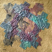
As with all exercises that I look froward to, I got off to a difficult start. I loved the crumpled tissue paper. The ripples and creases gave a lovely textural effect. I found if very difficult, however, to predict the results of the painted bondaweb, so it was hard to choose suitable background colours and fabrics. When fused to fabric, the results of the first 2 samples were dissappointing.


Perseverence paid off however, and I started to enjoy the exercise when I put the indigo painted bondaweb onto the 'gold' background.

The contrasting colours accentuated the rough imperfections of the bonding fibres and their web like texture.

Removing the rectangular background seemed to remove unneccessary 'clutter' and helped the bondaweb develop its own identity.


I sponged the next piece of bondaweb, half with prussian blue and violet, and half with lumiere halo violet-gold, and tore the shape of the cross.

I was so excited with the result that I photographed this stage bofore applying the next shape in case I spoiled it!


I was very pleased, however, with the slightly off-set tissue paper. Using just 2 shapes seems to keep the design simple, yet the off-set patterns make it interesting.


The next pattern created by 2 layers of torn and painted bondaweb is my absolute favourite so far. The first layer was sponged with Lumiere halo violet-gold, with a little prussian blue blended delicately here and there.


The second layer was sponged with a random mix of prussian blue and violet. The crosses were overlaid symmetrically, although it is hard to tell as the torn edges are so irregular.


I love the subtle pearlescent shimmer and the random, unpredictable irregularity of this design.


I liked the last design so much that I had to do another. This time I used gold textile foil for the cross on the first layer. The second layer of bondaweb was sponged with prussian blue and violet. I liked the metallic luxury of this design contrasting with the coarse, tactile texture of the 'gold' linen background.


13th June 2009
Making a Decorative Bonded Fabric
(Using a new cross pattern, and larger 20cm square samples).

I started off with a base layerof mid blue cotton fabric and sprinkled this with random pieces of frayed scrim. I added snippets of orange and yellow cotton fabric and then tore thin ribbons of metallic gold (as used for the background rectangle). I finished it off with spirals of yellow weft threads pulled from frayed linen.
I experimented with various colours of organza for the top layer of my new fabric, but decided that violet showed off the colours beneath to their best advantage.

It was really difficult to put scissors to this beautiful new fabric, but I cut the cross shape and placed it onto a cross of plain indigo hessian. This was then fused to a rectangle of metallic gold fabric.

I am very happy with the combination of textures in the end result.
For the next sample, I used a selection of blue and purple celophane sweetie wrappers overlaid with strands of gold tinsel and sprinkled with gold sequins and glitter.
I chose a plain gold coloured slub weave fabric for the cross behind this, and for the background rectangle I chose a shiny violet synthetic fabric stamped with dark blue patterns.


Snippets and off-cuts of orangeand yellow thread were topped with gold glitter and a thick yellow slub yarn and then 'sandwiched' with a graduated blue/yellow organza.

Somehow, the darker coloured organza used on the previous 2 samples seems to offer less reflection and therefore shows off the threadsand fabrics beneath to better effect, however it is fascinating to see how different coloured organzas can make such a difference to the colours of the threads underneath.
I experimented with various crosses underneath, but decided that the blue crumpled tissue paper complemented the pattern best, although in hindsight, I think that torn edges would have looked better on the tissue paper.
I have a beautiful field of buttercups in front of my house and wanted to preserve, and create a fabric from some of these.

I thought it would be fun to experiment with a layer of angelina on top (sprinkled with snippets of yellow cellophane sweetie wrappers.)

I think the result is horrible. The angelina looks gaudy and vulgar. If I was to use this again it would need to be used with much more subtlety.


This exercise has proved the value of experimentation - good results are not always to be expected!!!

Monday, 25 May 2009

Chapter 5 - Fabric Selection and Decoration (contd.)

I really enjoyed printing the fabric. I thought I'd exhausted all the printing patterns I could think of in various colour combinations, and then I discovered a delightfully random mess of overlapped cadmium yellow and yellow ochre. Wow! I was totally absorbed by this exercise and could have continued indefinitely, but I thought it best to print more bits of fabric later when I knew which fabrics, patterns and colours I enjoyed using the most.

Sunday, 24 May 2009

Chapter 5 - Fabric Selection and Decoration

I have collected an exciting stash of polyesters, nylons, organzas and silky synthetics given to me by the girls at work. Off-cuts from their suits etc.

I also have a passion for collecting natural fabrics. I have calico, scollata, cotton scrim, muslin, hessian, various weights of linen, silk noil and habotai all in natural colours, so last weekend, following a Guild workshop, I decided to dye a selection of them.

First I tried space dyeing in plastic bags, but the results were a bit pale and far too patchy for the purpose (I think I put too much fabric into the bags), so on Sunday, I dyed them again, but this time by mixing up a couple of larger dyebaths.

I used procion dyes. Golden Yellow was just perfect for my gold colour. For the indigo, I mixed 3 parts blue to 1 part intense red.


The results were much better second time around, I'm a little dissappointed that all the fabrics are pretty much the same colours, but I will just have to be inventive with the printing!

Sunday, 17 May 2009

Chapter 4 - Cut and Fold Designs in Coloured Papers


Well, after enjoying the black cut outs so much, I was surprised and frustrated to find that this exercise was really difficult. In preparation, I had cut out a large selection of shapes in different colours, but really struggled to put them together in pleasing arrangements.

After a few hours of experimentation (and after resorting to looking for inspiration on other student's blogs and at Sian's samples) I managed to produce 6 samples. Viewing them the next morning I have to say that I was very pleased and felt they were well worth all the effort.

I made the mistake, however, of showing them off to an artist friend who challenged me to express WHY I liked specific designs! So after a few more hours of soul-searching and analysis I decided that it was because they were all symmetrical and balanced which made them aesthetically pleasing.

No.3 is my favourite. Unlike the others, the colours are 'muddy' and muted. It has the appearance of a harsh rocky texture. The eye is drawn into the focal point at the centre of the design which gives a feeling of depth and perspective.

Designs 1,2 and 5 are made up of simple geometric shapes that are strongly emphasised by the vivid contrast in colour of the paper. 4 and 6 are beautifully intricate, lacy patterns which again are accentuated by the powerful contrast in colour.

Carolyn also quizzed me as to why I was doing the course. After much thought and consideration I decided that it was for personal development. to learn the concept of design and to stretch my boundaries and enable me to feel confident to develop my own designs from my own inspiration.

Having decided upon this, I realised that I really ought to 'step outside of my comfort zone' and produce a few more 'random' designs. This took a lot more time than the last six. I really struggled, but eventually came up with 3 designs that I found remotely attractive. Although I prefer the previous 6 designs, I feel that the last 3 have more 'personality'. They are unconfined and unpredictable.

I hope that Carolyn reads this and feels bad for the anguish and sleepless night she has caused! lol!