 |
| 06.04.01 |
I selected a range of polyester fabrics, from heavyweight polyester satin, dress lining, soft, lightweight polyester net, and a polycotton mix. I painted and printed papers with disperse dyes, and, when dry, transferred these onto the fabrics with a hot iron. It was interesting to see how many prints I could get from one piece of transfer paper as it gradually faded with use, and also how the print ‘took’ on different fabrics. The polycotton print was a lot more subtle/subdued/faded compared to the other fabrics due to the cotton content.
 |
| 06.04.02 |
I crumpled a plastic bag onto the wet painted paper and allowed it to dry before removing it, to give a lovely water-marked effect.
 |
| 06.04.03 |
I got a little carried away printing with bubble wrap, but I think the ‘bubble’ effect relates perfectly to the subject of water. It was also interesting to see the colours of one painted paper transferred onto a paper painted with different colours.
 |
| 06.04.04 |
 |
| 06.04.05 |
 |
| 06.04.06 |
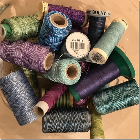
I collected a selection of polyester machine threads in variegated and metallic colours to match my colour scheme.
 |
| 06.04.07 |
I experimented with markal paintsticks. The image below was stencilled through sequin waste over a commercially printed fabric.
 |
| 06.04.08 |
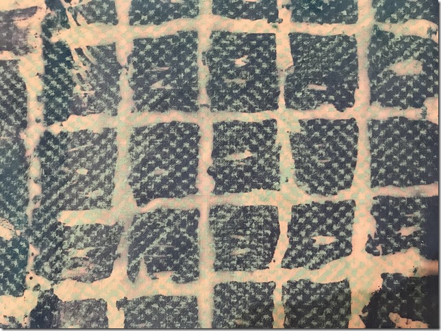
Again, with markal paintsticks, the fabric below was one I had screen printed for a previous project. The fabric is quite light in weight and so was suitable for frottage over a nylon mesh fabric.
 |
| 06.04.09 |
I then soaked a range of cotton and silk fabric in a soda ash solution.
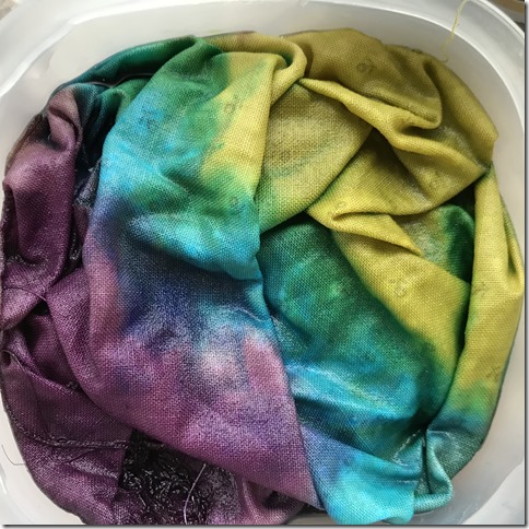
I scrunched and stacked a couple of commercially printed fabrics into a jar, poured dye on them and left them for a few hours whilst I painted the rest of the fabrics.
 |
| 06.04.10 |
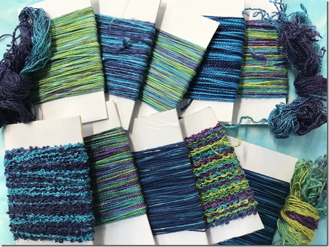
I also dyed a selection of threads to match my colour scheme. The first was a blue ombre effect.
 |
| 06.04.11 |
The other group of threads were dyed in a variegated range of colours.
 |
| 06.04.12 |
At the end of a very enjoyable day, I ended up with a pleasing array of fabric and threads to use in the next few projects.
 |
| 06.04.13 |
 |
| 06.04.14 |
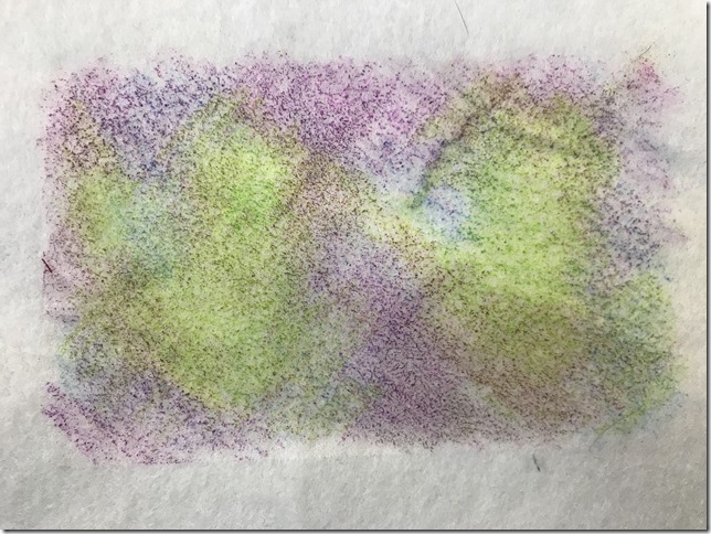
The next method I experimented with was adding colour to transfer adhesive.
 |
| 06.04.15 |
I was pleasantly surprised by the results that could be achieved with coloured crayons. I ironed this sample onto plain white felt.
 |
| 06.04.16 |
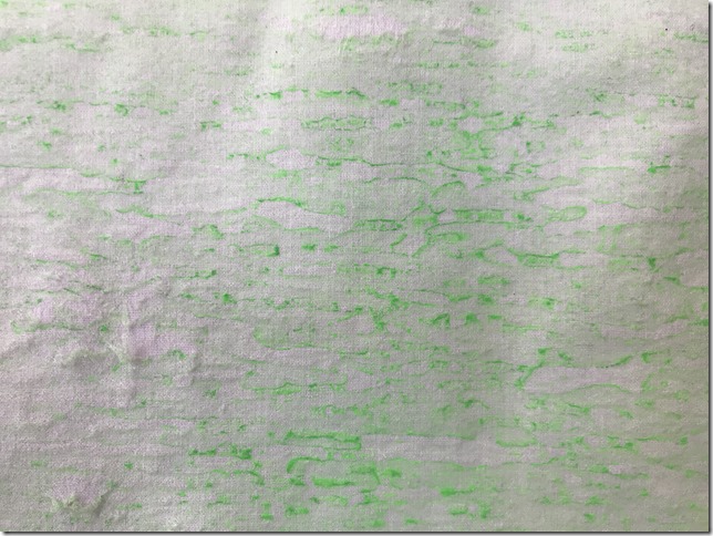
Fluorescent green acrylic paint was watered down, and rippled the backing paper, to give a lovely watery effect.
 |
| 06.04.17 |
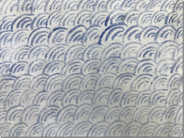
I painted one of my patterns from Chapter 1 onto the bondaweb with blue drawing ink.
 |
| 06.04.18 |
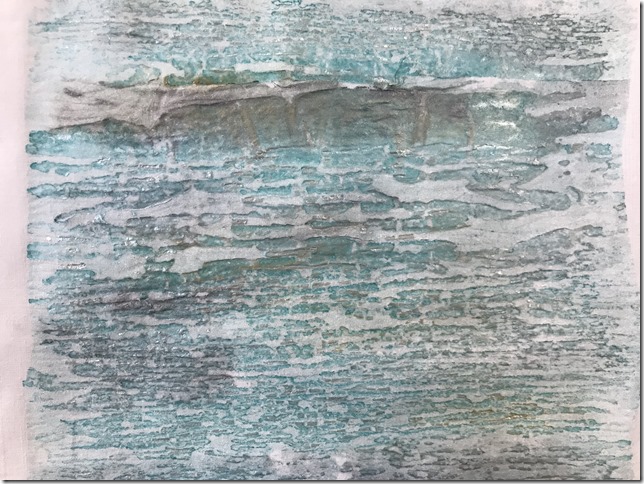
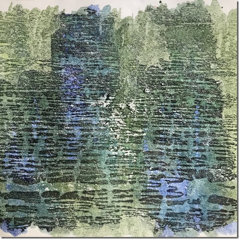
Jacquard Lumiere in pearlescent turquoise, and silver acrylic paint onto bondaweb, then ironed onto plain white cotton.
 |
| 06.04.19 |
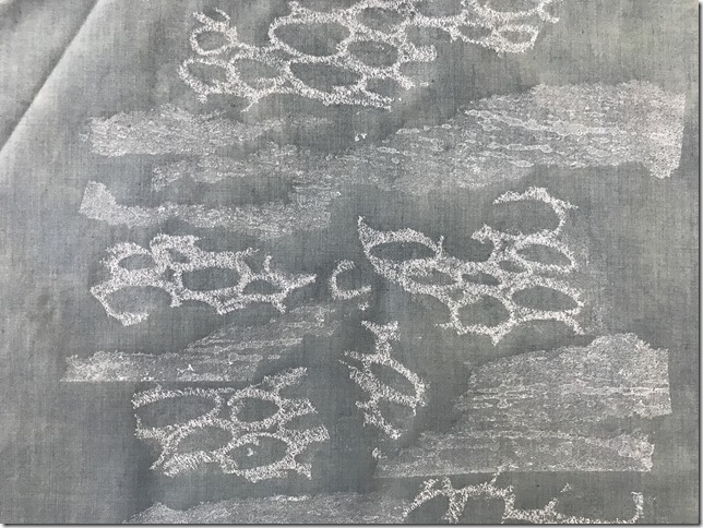
Silk paints.
 |
| 06.04.20 |
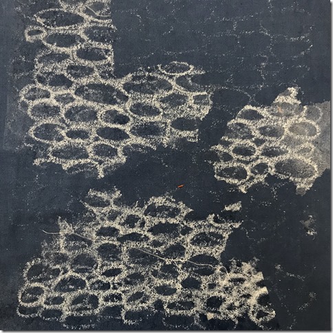
White oil pastel circles, and white acrylic paint onto a green/grey polycotton. I thought it might give an interesting effect if I tore the bondaweb and layered the two designs together.
 |
| 06.04.21 |
White oil pastel circles onto a dark blue cotton.
 |
| 06.04.22 |
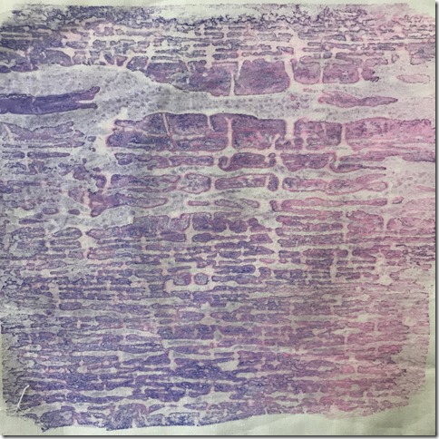
I watered down some of my thermo-chromatic printing ink and painted it onto the bondaweb. The colours seemed to separate very slightly giving a touch of a pink halo around the ‘blocks’ of purple.
 |
| 06.04.23 |
But the ink still changed colour beautifully when heat was applied!
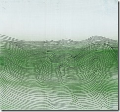
This year, three people have had a massive influence on my research/studies. At Summer School, Bobby Britnell introduced us to the work of Wilhelmina Barnes Graham. Her sea paintings using rows of wavy lines were so simple, yet beautifully evoked the movement and rhythm of the sea.
 |
| 06.04.24 |
Nancy Crow’s amazing EXPLORATIONS IN MONO-PRINTING, showcased at the NEC’s Festival of Quilts. Mono printing has always been my nemesis, I guess I find it too messy and unpredictable, however, after seeing Nancy’s imposing display of quilts, I decided I ought to force myself to experiment further.
 |
| 06.04.25 |
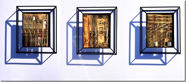
In Sumi Perera’s interactive work UNBUILDING BLOCKS: VARIATION ON A THEME at the 62 Group ‘Cntl/Shift’ exhibition at the MAC in Birmingham, she used thermo-chromic printing ink. Sadly, we were unable to see the effects due to Health & Safety regulations, but, as a screen printer, I felt it was something I’d like to explore.
 |
| 06.04.26 |
Currently, in the Turbine Hall at Tate Modern, Cuban artist and activist Tania Bruguera has created a heat-sensitive floor that, when visitors work together using their combined body heat, reveals a hidden portrait of a Syrian refugee, made with thermo-chromic ink.
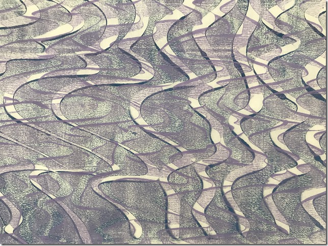
All this being said, I thought this would be a perfect opportunity to experiment with combining all three, so spent the afternoon mono-printing onto cotton organdie.
 |
| 06.04.27 |
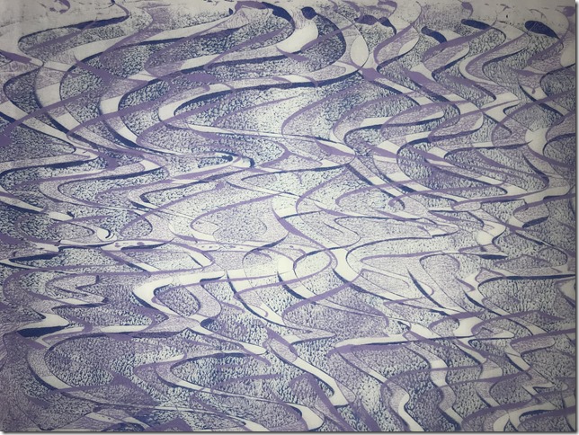
I mixed prussian blue acrylic paint with textile medium to prolong the drying time and to make the surface softer and more suitable for stitch, rollered it onto a plastic sheet and drew the wavy lines with a rubber colour shape tool before printing onto a piece of cotton organdie.
 |
| 06.04.28 |
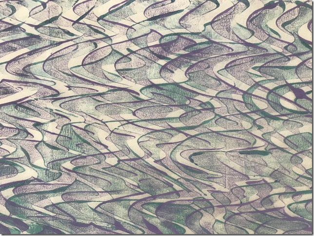
I then printed a second layer of wavy lines with thermo-chromatic printing ink. Its purple, but turns pink when heat is applied.
 |
| 06.04.29 |
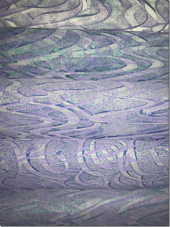
On some pieces of fabric I printed a third layer of jacquard Lumiere pearlescent turquoise, which gives a lovely iridescent sheen when held up against the light.
 |
| 06.04.30 |
I didn’t intend to print the wavy lines over the spiral image, but due to the speed I was working at, ‘it just happened’! The result shows that two different patterns can work together quite nicely, and I might follow this through with some of my stitching samples in the next chapter.
 |
| 06.04.31 |
 |
| 06.04.32 |
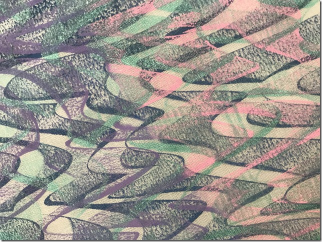
The purple print layer turns pink when heat is applied. This can be heat from a radiator, an iron, a mug of hot water, or even warm breath. It doesn’t seem to change with heat from my hand, but then its winter, and my hands are always cold!!!
 |
| 06.04.33 |
 |
| 06.04.34 |
The speed at which you need to work when mono-printing forced me to be spontaneous. If you don’t work quickly, the ink/paint will dry on the printing plate. The patterns created by the wavy lines were much looser and uncontrolled compared to my usual carefully planed and structured pen work.
I also noticed that where I’d concluded that I’d made a ‘mistake’ on some prints, the un-intended pattern led me to think of ways I could possibly stitch into the print in a much less predictable manner in the next chapter.
Working quickly forced me to make ‘mistakes’ in layering colours, which led to ‘happy accidents’. I usually spend a lot of time planning colour arrangements and working out how I think something should look before embarking upon an exercise. It didn’t feel good to be ‘out of control’, but I really think I learned a lot, and am very happy with the results.

Wow! Julia, you are on a roll. Lots of exciting ideas explored and I love your colours!
ReplyDelete