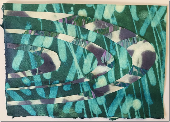
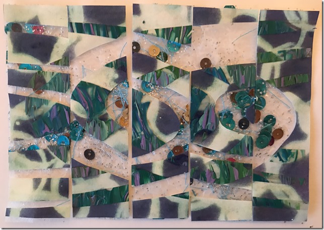
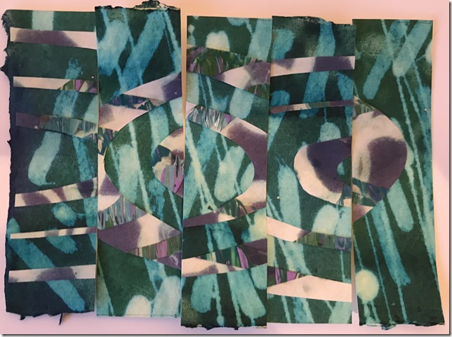
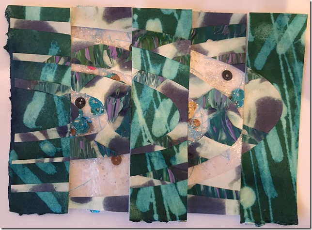
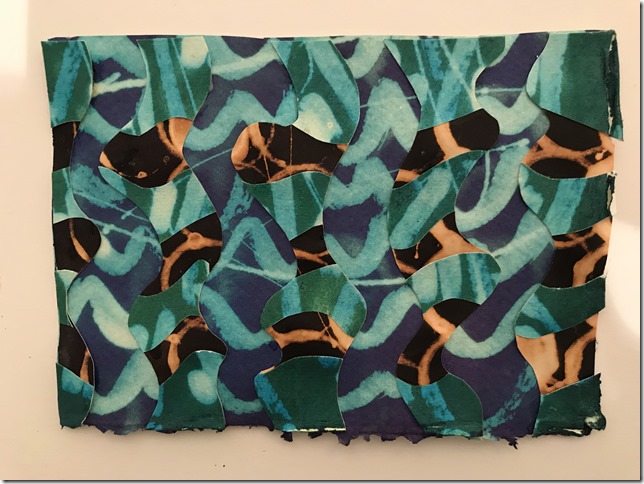
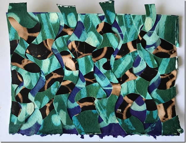
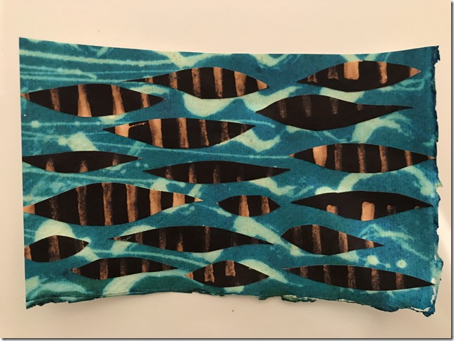
The task was to identify very simple shapes from images of sea and sky from Chapter 1, and, using decorated papers, form patterns dictated by their rhythmical qualities.
 |
| 06.02.01 |
So to start off, I decorated a large selection of acetate, bubble wrap, khadi paper, cartridge paper & newsprint with relief rubbings, discharged ink, fused polythene, etc as per my experiments in Chapter 1.
 |
| 06.02.02 |
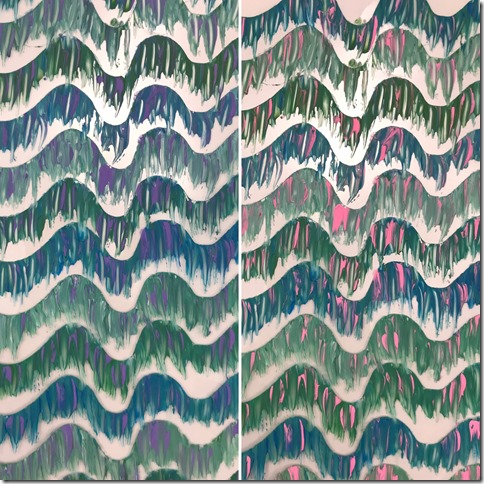
I particularly enjoyed working onto an acetate sheet, pulling acrylic paint off the edge of a sheet of plastic, cut with a wavy edge. I like the contrast between the clean, sharp edged where the paint is brushed from the template, and the rough uncontrolled side displaying the brush strokes.
I used touches of thermo-chromatic paint, which changed colour from purple on the left, to hot pink on the right, when subjected to heat.
 |
| 06.02.03 |
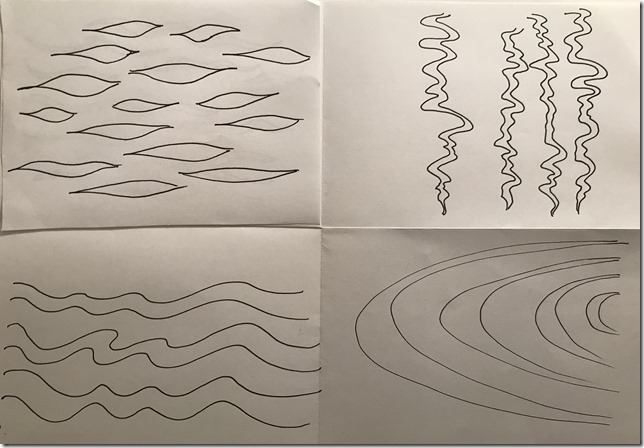
I sketched a few rhythmical patterns from the images in Chapter 1 to use as a reference to cut patterns from my decorated papers.
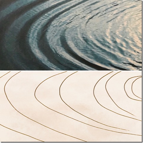
The first image I chose was the photograph of the concentric ripples.
 |
| 06.02.04 |
 |
| 06.02.05 |
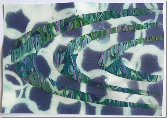
Initially, not sure how to get started, I tentatively cut some simple shapes from my acetate sheet and laid them over another decorated paper.
 |
| 06.02.06 |
From this new design, I cut out the same shapes, in the opposite direction, and placed this on a sheet of sequin and glitter bonded acetate. This gave me an instant burst of confidence! I loved the result and was compelled to experiment further!
 |
| 06.02.07 |
I pasted the left-over sections to another paper.
 |
| 06.02.08 |
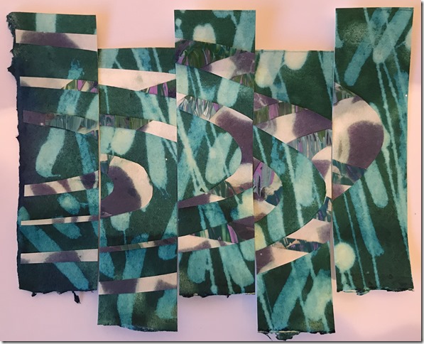
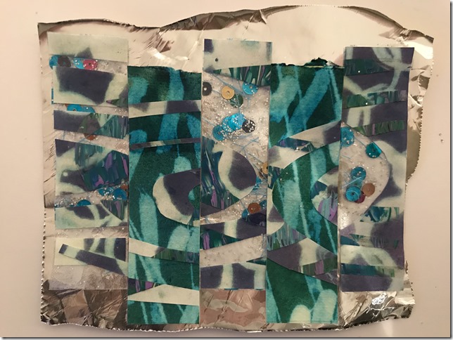
I then sliced both papers into vertical sections and experimented with various ways of combining the two designs….
 |
| 06.02.09 |
 |
| 06.02.10 |
 |
| 06.02.11 |
 |
| 06.02.12 |
 |
| 06.02.13 |
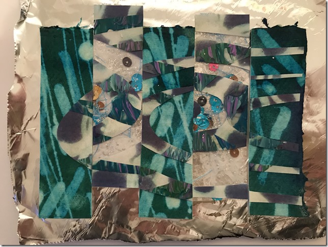
I eventually staggered the strips and pieced them together in a random arrangement onto silver foil.
 |
| 06.02.14 |
 |
| 06.02.15 |
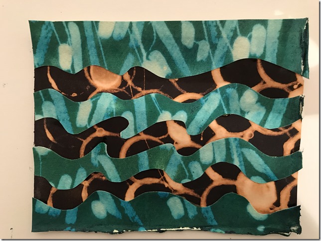
My next experiment was inspired by Wilhelmina Barnes Graham’s waves.
 |
| 06.02.16 |
I cut waves into a sheet of decorated khadi paper (I love the way this paper takes coloured dyes!) and placed it onto a pattern of discharged black ink.
 |
| 06.02.17 |
I then cut similar waves in the opposite direction, placing it onto an indigo blue bleached background.
 |
| 06.02.18 |
I rotated the cut-out shapes and replaced them in slightly off-set positions.
 |
| 06.02.19 |
I then experimented with staggering the overlaid strips
 |
| 06.02.20 |
…and again in another formation which allowed more of the blue patterned paper to show through.
I really like the way this still gives the effect of fractured ripples in water.
 |
| 06.02.21 |
My third experiment was wavy lines again, placed onto painted & flattened bubble wrap.
 |
| 06.02.22 |
I placed this onto a silver foil background for added reflection, then cut out similar wavy lines. I rotated some of the resulting wavy strips, allowing them to overlap each-other in some places, and to leave gaps in other places. This was then placed on a sheet of newsprint decorated with a relief oil pastel rubbing, overlaid with purple procion dye. Interestingly, this new pattern gives a similar effect to the rippled water pattern in my initial sketches.
 |
| 06.02.23 |
I then cut the design into quarters, rotated the panels and repositioned to fracture and develop the design further.
 |
| 06.02.24 |
I cut lozenge shapes from discharged ink paper and attached them onto another sheet for a rippled water effect, for my forth design development experiment.
 |
| 06.02.25 |
 |
| 06.02.26 |
I cut further lozenge shapes from this new design. I placed this onto a relief rubbing with green brusho, and re-positioned the lozenges randomly.
 |
| 06.02.27 |
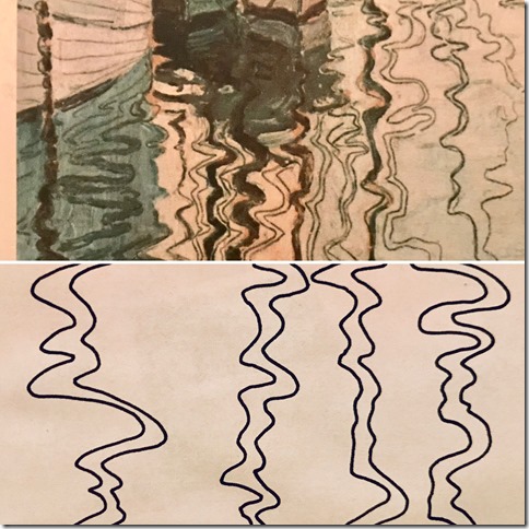
Using Egon Scheile’s reflected water as inspiration I carefully cut strips of discharged ink paper.
 |
| 06.02.28 |
 |
| 06.02.29 |
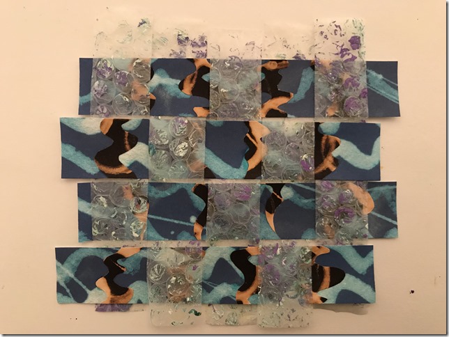
I cut this into horizontal bands and wove it with strips of bubble wrap.
 |
| 06.02.30 |
I was really happy with this design. I’m more comfortable with geometric structure and order than I am with random, organic disorder, but I do tend to get a little too precious, and scared to push things further, so after taking a photograph, in the spirit of ‘nothing ventured, nothing gained’, I cut it up again in horizontal strips of wavy lines, replacing the lines in a staggered formation, and pasting onto a purple sequin waste rubbing.
 |
| 06.02.31 |
Did I take this design development too far? I’m not sure!


