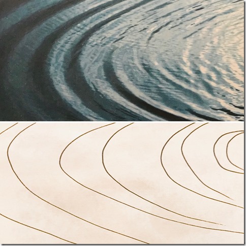
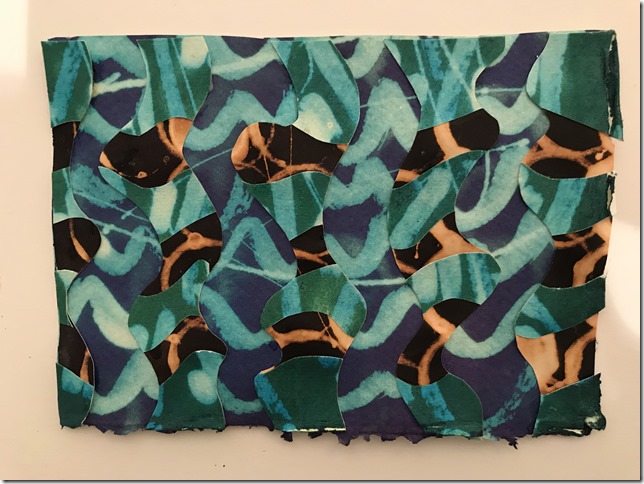
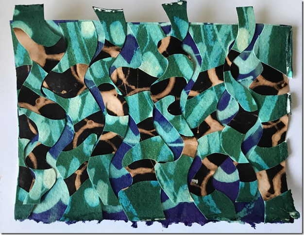
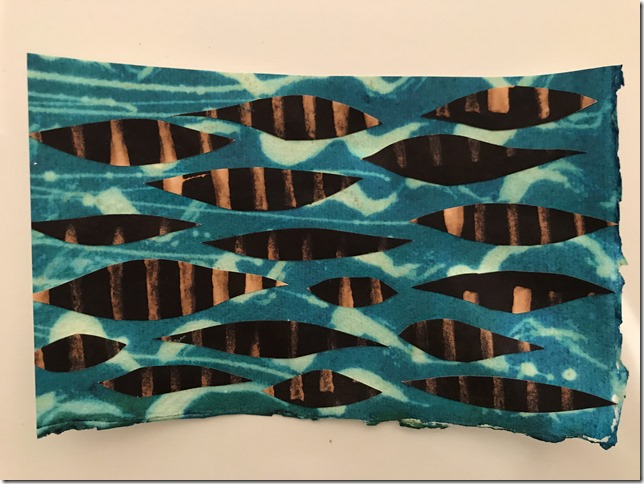
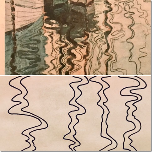
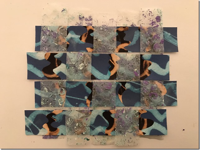
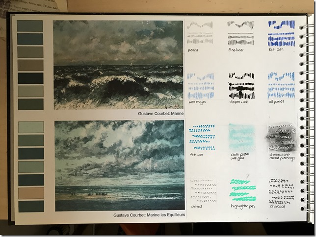
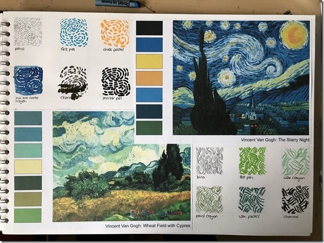
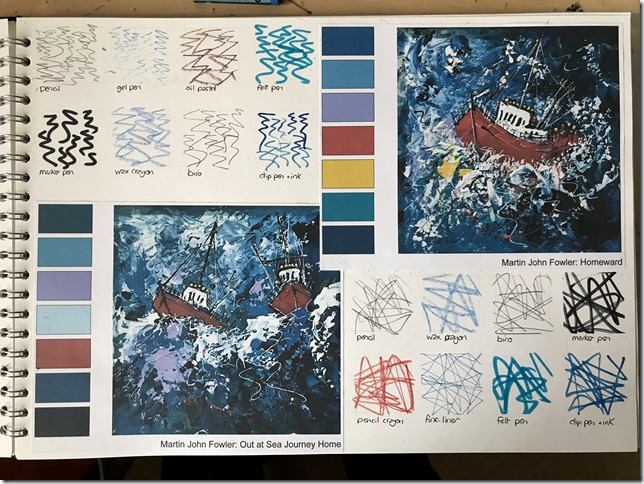
I made a collection of colour photographs of different types of skies or water effects. Some were photographs of my own, some were from Google Images. I was looking for interesting colour combinations and areas of textural effects in the sky, wonderful cloud formations, textural effects and water surfaces - ripples, reflections, froth and bubbles.
I also collected images of work by painters who use water and sky as their inspiration.
 |
| 06.01.01 |
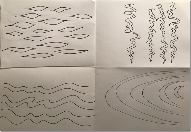
Using as many varied drawing implements as I could find, I made marks covering a small area of 4x4cm, inspired by the patterns that I could see in the image.
For size reference, all of the following work is carried out in an A3 sketchbook.
 |
| 06.01.02 |
 |
| 06.01.03 |
 |
| 06.01.04 |
 |
| 06.01.05 |
 |
| 06.01.06 |
 |
| 06.01.07 |
 |
| 06.01.08 |
 |
| 06.01.09 |
 |
| 06.01.10 |
 |
| 06.01.11 |
 |
| 06.01.12 |
 |
| 06.01.13 |
I then selected a few of the marks made in the previous exercise and made similar sized areas of texture and pattern by building up more than one layer of the same type of mark in each patch, but using different implements.
 |
| 06.01.14 |
SGRAFITTO
I experimented with different types of crayon in contrasting colours, one layered over the top of the other, to see which top layer could be scratched away to reveal the colour below.
 |
| 06.01.15 |
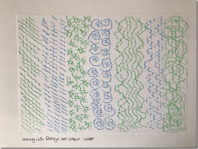
FROTTAGE
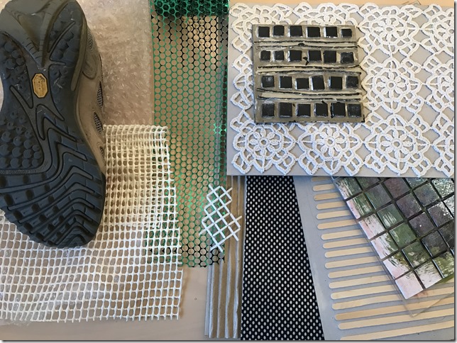
I made a collection of textured and patterned surfaces to make rubbings.
 |
| 06.01.16 |
 |
| 06.01.17 |
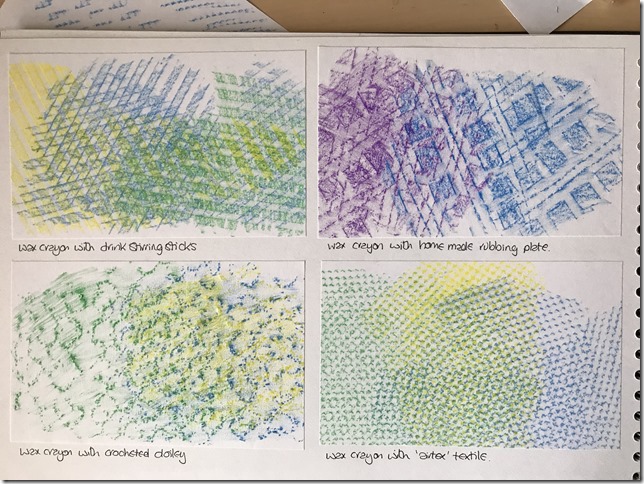
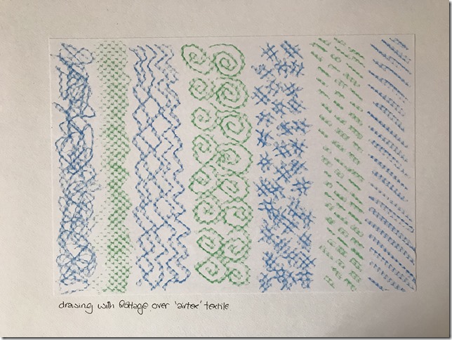
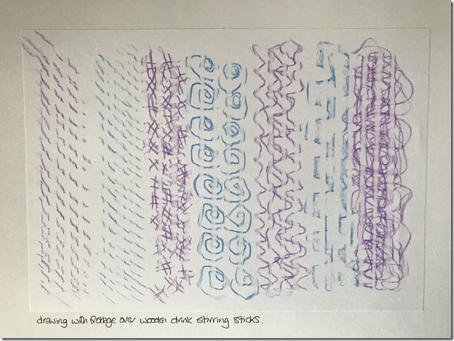
I moved the relief surface under the paper to give different rubbed effects, building up layers of crayoning. I found wax crayon on standard copy paper gave the most successful results in this exercise.
 |
| 06.01.18 |
 |
| 06.01.19 |
 |
| 06.01.20 |
 |
| 06.01.21 |
 |
| 06.01.22 |
RESIST METHODS
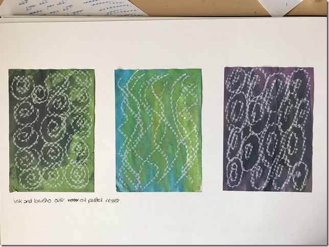
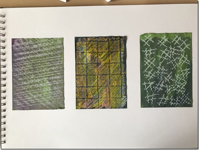
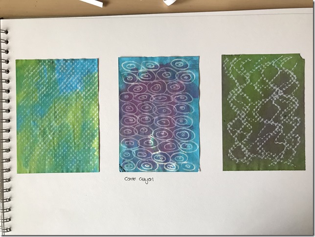
I used oil pastel and conte crayon to draw patterns, sometimes over texture plates.
I then used a painted black quink ink, green & blue brusho, and purple procion dye over the surface, allowing the liquid inks to flow off the waxy or chalky surface of the crayons.
 |
| 06.01.23 |
 |
| 06.01.24 |
 |
| 06.01.25 |
 |
| 06.01.26 |
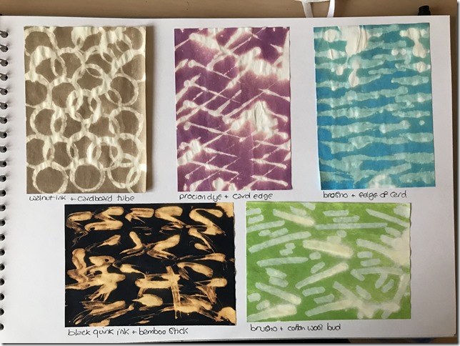
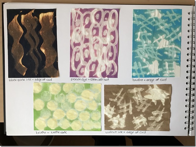
DISCHARGE
I painted papers with black quink ink, walnut ink, brusho and procion dye, and let these dry. Colour was then removed using bleach and a variety of different mark making implements. I found this process much less controllable than the others. Bleach dribbled across the page. Sometimes it left large, heavy deposits that bleached colour away very strongly. In other areas it gave very fine, scratchy marks. This gave random, disorderly, but exciting results. I particularly liked the way the black quink ink bleached out to a sort of rusty colour.
 |
| 06.01.27 |
 |
| 06.01.28 |
 |
| 06.01.29 |
 |
06.01.30
|
TRANSPARENT SURFACES
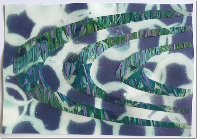
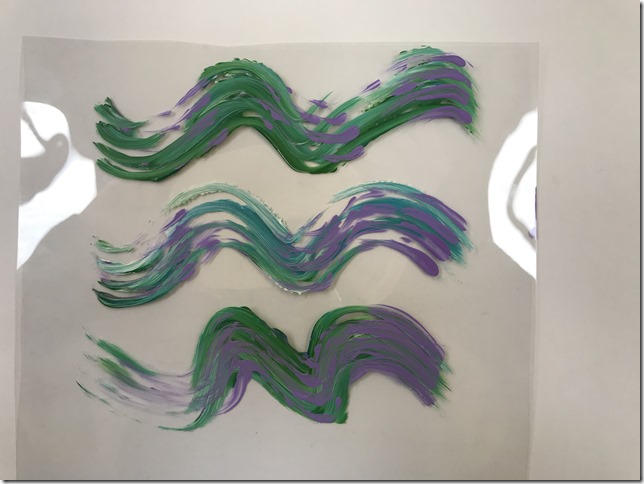
Using a sponge brush, I made marks onto transparent acetate with acrylic paint.
 |
| 06.01.31 |
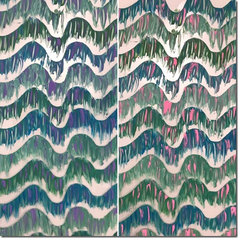
over the top of the acrylic paint, I painted ‘thermo-chromatic’ screen printing ink in purple.
 |
| 06.01.32 |
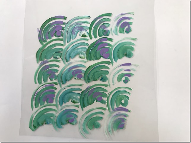
when subjected to gentle heat eg, radiator or hairdryer, the purple ink turns pink.
 |
| 06.01.33 |
 |
| 06.01.34 |
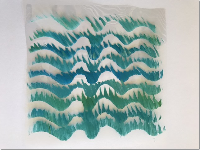
I cut a wavy edge from a piece of paper, and dragged paint from the stencil, over the edge onto the acetate sheet.
 |
| 06.01.35 |
I cut and opened a ‘poly pocket’, painting on the inside, and then refolding. I then fused the poly pocket together using an iron on low heat (over baking parchment).
 |
| 06.01.36 |
I did the same with a fine polythene bag. The polythene melted much more easily and started to shrivel away from the heat quite quickly, however I do like the ‘watery’ effect this gives, so I turned up the heat very slightly and ironed a little longer to intensify the effect.
 |
| 06.01.37 |
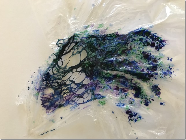
Again with a polythene bag, I sandwiched some wax crayon shavings between the 2 layers. The effect was amazing. The wax melted and blended and followed the ripples as the polythene shrivelled and distorted, but it was very difficult to control the right amount of heat from the iron. I was so pleased with the result that I overheated the sample below as I was trying to make it ‘even better’! The bag melted and made holes in a very interesting and dramatic way.
 |
| 06.01.38 |
For the next sample I turned down the heat, but held the iron over the crayon longer. Again, there are some very interesting water marks appearing in the crayon, but I wasn’t quite so happy with the way the colours ‘over-blended’.
 |
| 06.01.39 |
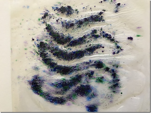
Third time lucky, this was the result I was trying to achieve. Just the right temperature and length of time with the iron, the wax melted without ‘splodging’ and the polythene fused and distorted just enough to give soft ripple effects. I also added a small amount of silver glitter to this sample.
 |
| 06.01.40 |
Thread snippets fused inside a poly pocket.
 |
| 06.01.41 |
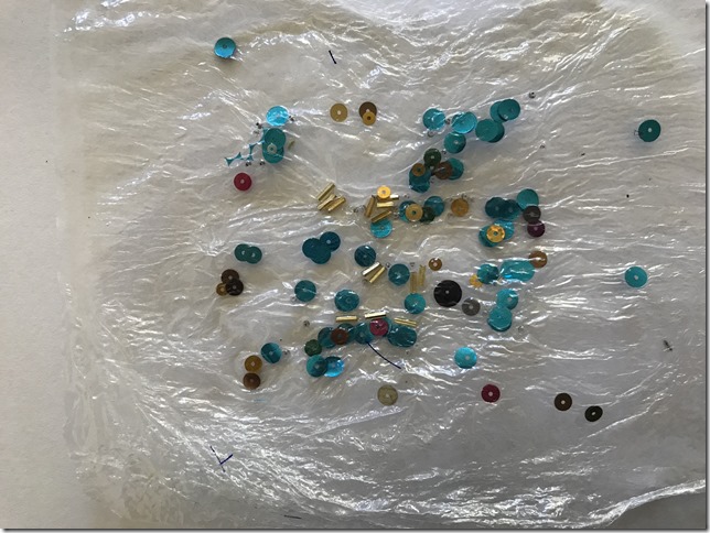
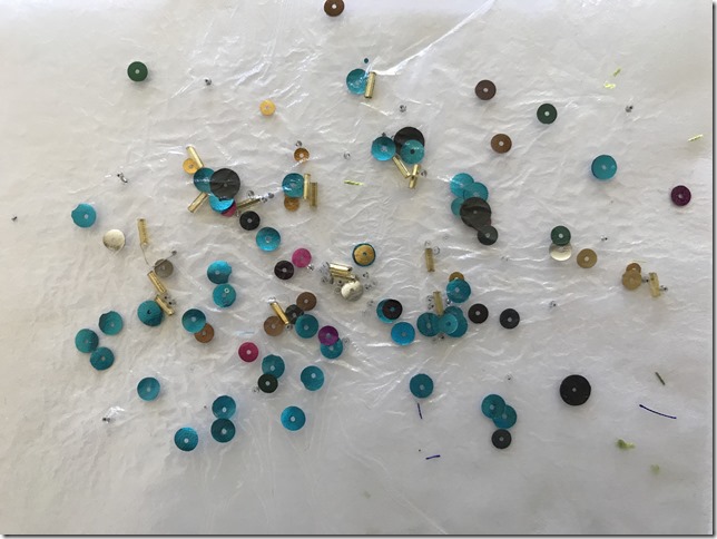
Beads and sequins sandwiched between 2 layers of polythene. This secured the components much more securely than in the poly pocket below, which didn’t seem to fuse around the items quite so closely, allowing them to move around.
 |
| 06.01.42 |
Beads and sequins fused within a poly pocket didn’t seem to fuse so closely around the components, allowing them to move very slightly where the sheets hadn’t quite sealed closely up to the items.
I also found the poly pocket to be a little dull and very slightly cloudy, compared to the plastic bag which remained shiny and transparent.
 |
| 06.01.43 |
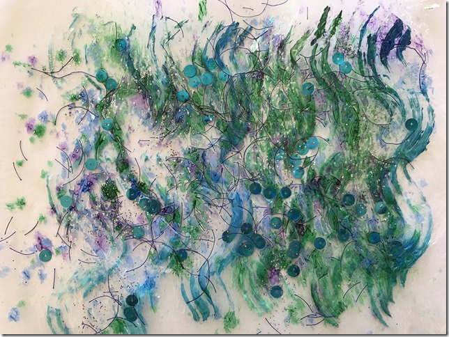
So then sandwiched acrylic paint, wax crayon shavings, snippets of thread, sequins and glitter inside a polythene bag, just for fun!
 |
| 06.01.44 |
I dragged acrylic paint over bubble wrap to emphasise the textural surface.
 |
| 06.01.45 |
I pressed the following samples of painted bubble wrap with an iron. The bubble wrap was surprisingly resilient to the heat. I ironed these samples for a few minutes with a full heat cotton setting. The bubbles eventually popped and flattened, emphasising their circular pattern of the bubbles and creating a more translucent, dull, cloudy surface.
 |
| 06.01.46 |
 |
| 06.01.47 |